Scoobert Doobert
Album and Single Artwork
Album and Single Artwork
What began with the Dragon Ball $D album cover in 2020 evolved into an ongoing creative partnership built around developing a cohesive visual identity for Scoobert Doobert. Together, we established a collaborative process where the music and artwork influence one another from the earliest stages of each release. Every album cycle explores a distinct artistic direction while maintaining a recognizable brand through consistent illustration, color systems, and design principles.


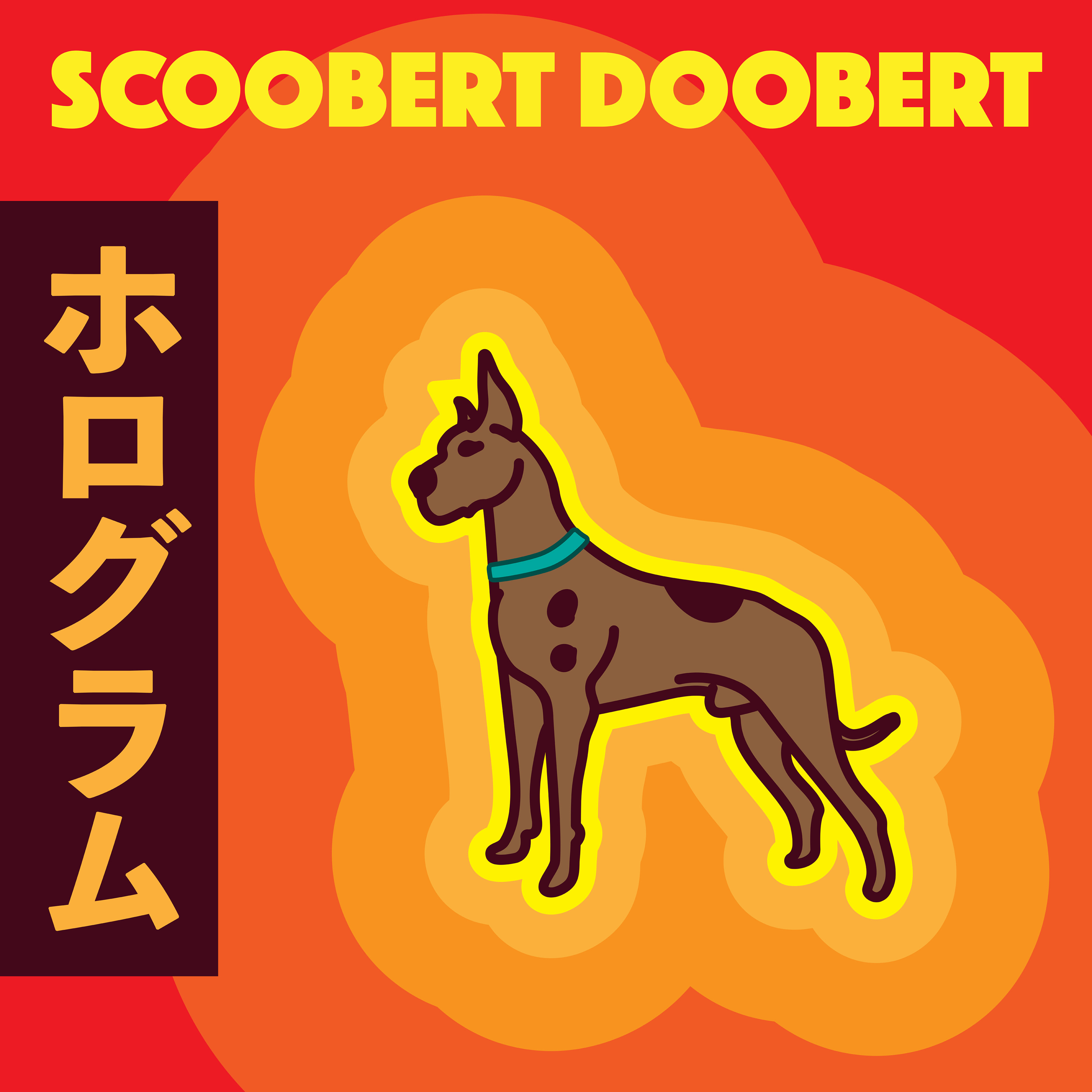
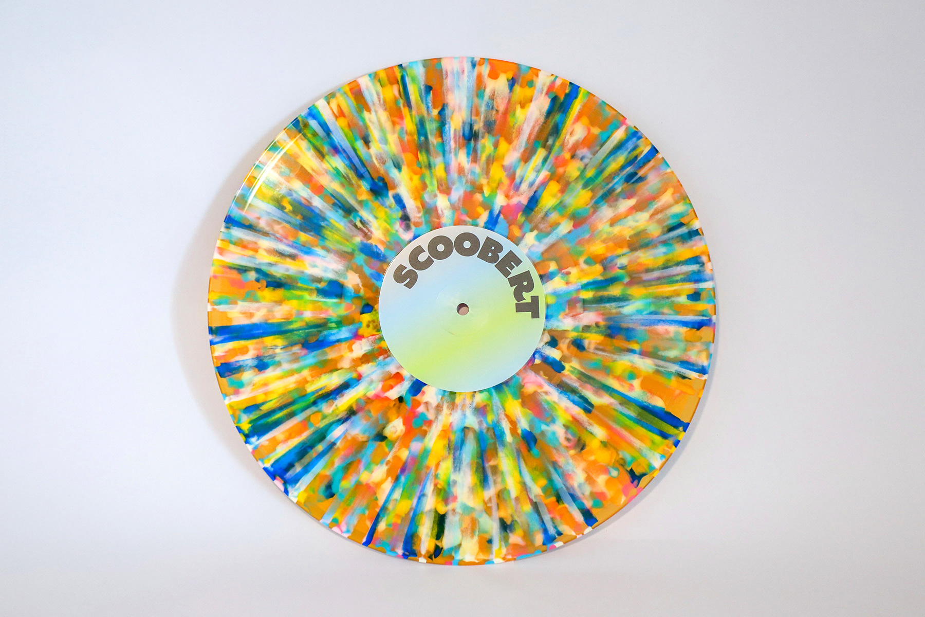
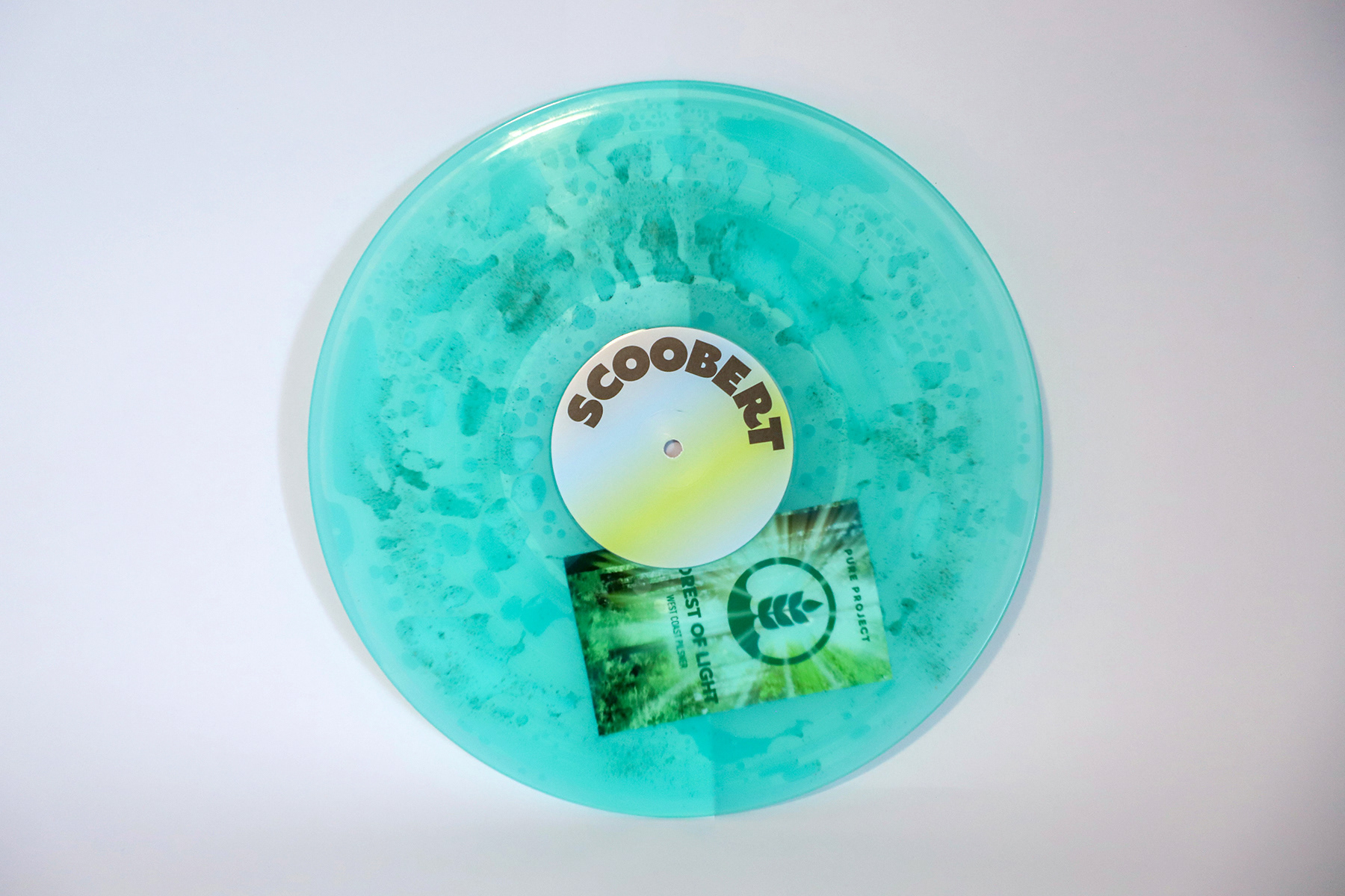
Möb (2023)
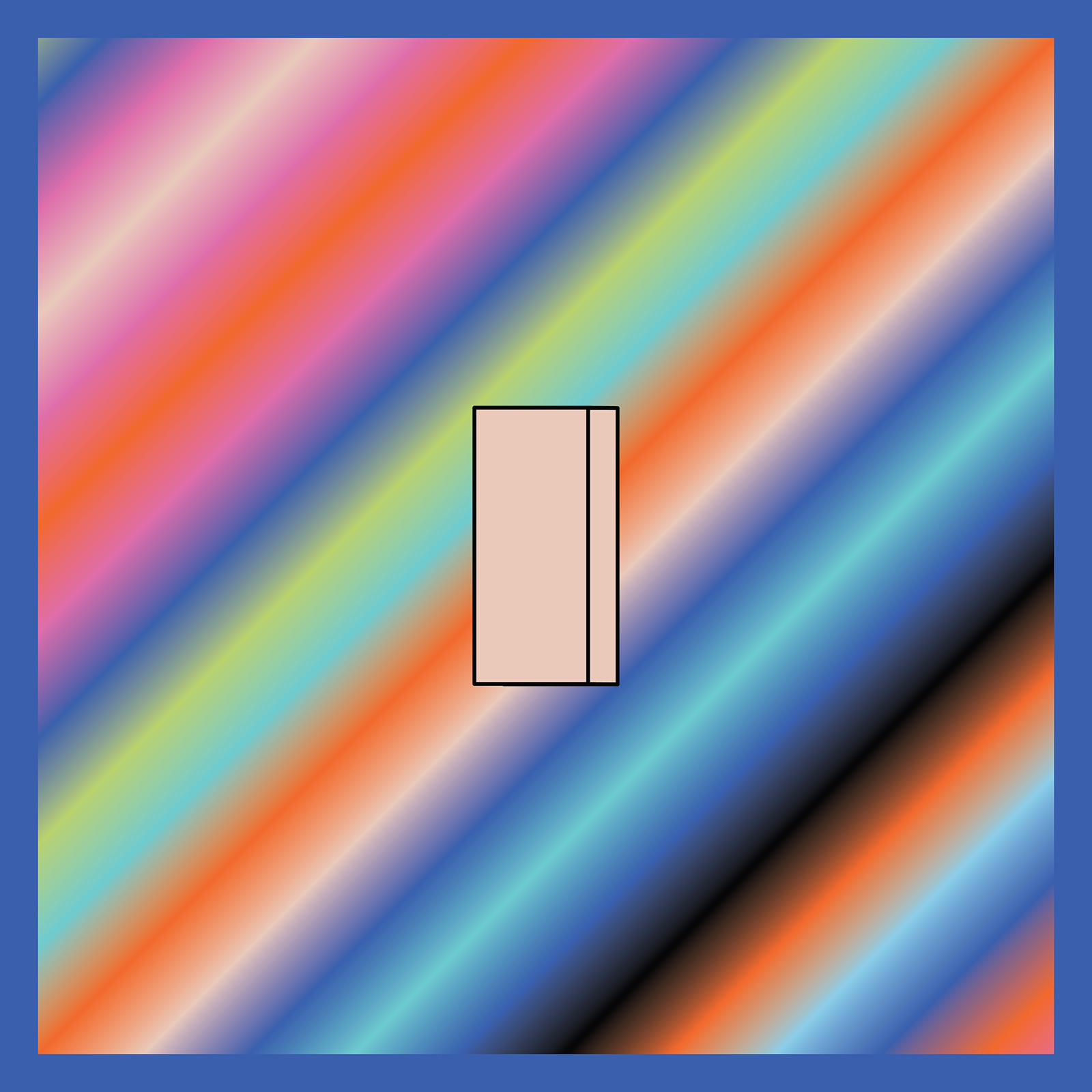
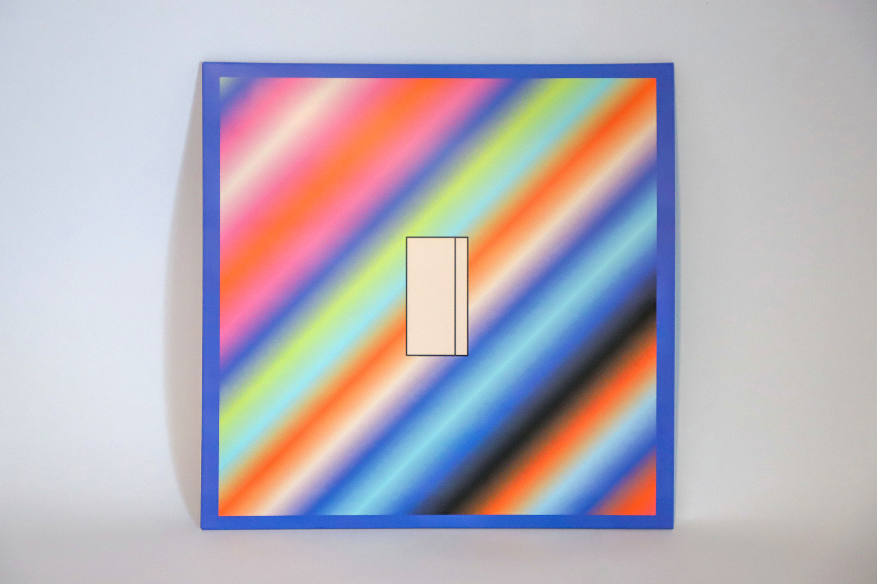
Möb is the first chapter of the four-album Möbius project, which will unfold across Möb, I, Us, and Möbius. Each single is represented by an object referenced in its lyrics, creating a visual language that connects the artwork across the entire release. For Möb, every object was illustrated in my signature limited-color style, establishing the project's core color palette and visual identity. The album cover introduces this palette with a dimensional treatment, using a gradient composed of every color featured throughout the release.
SINGLES


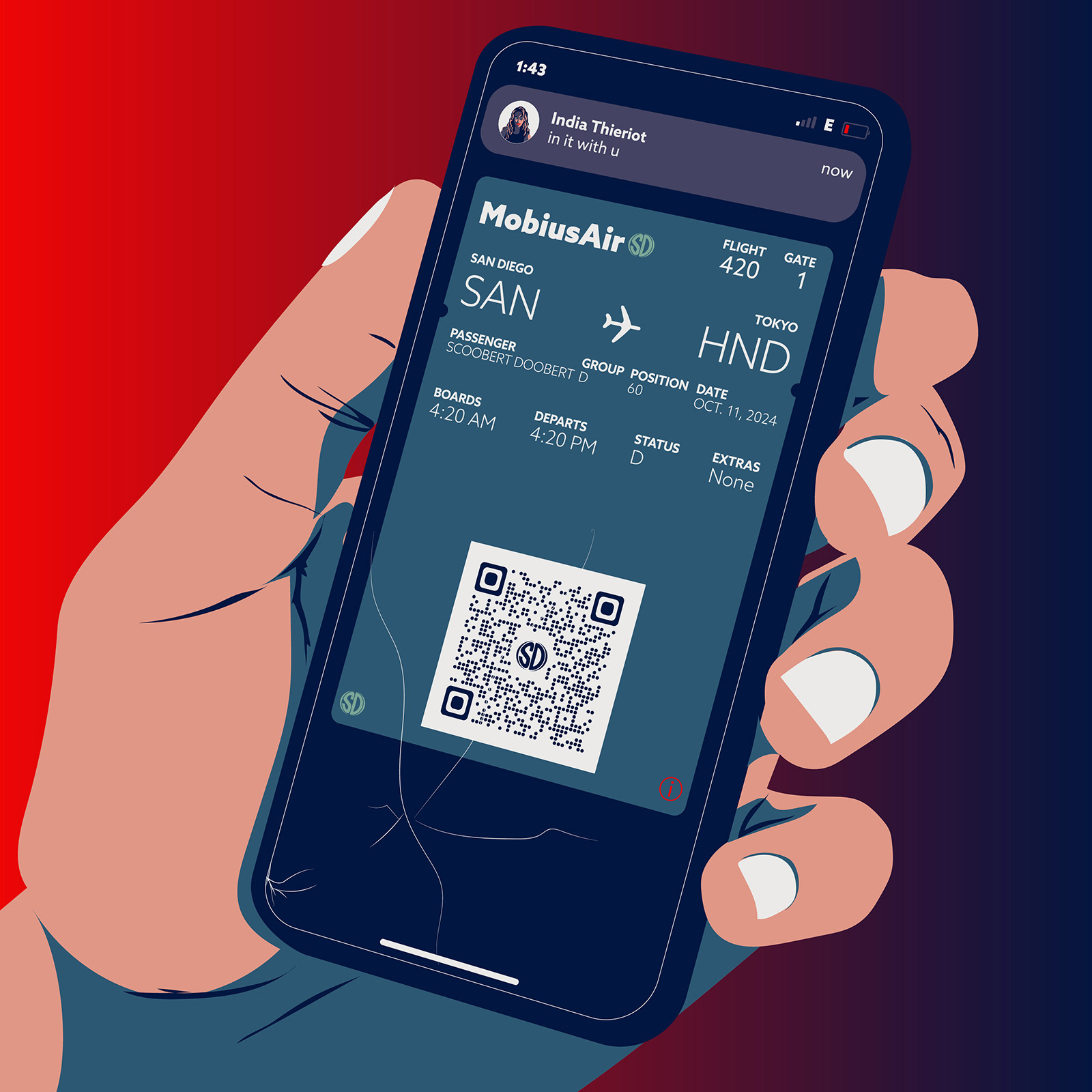
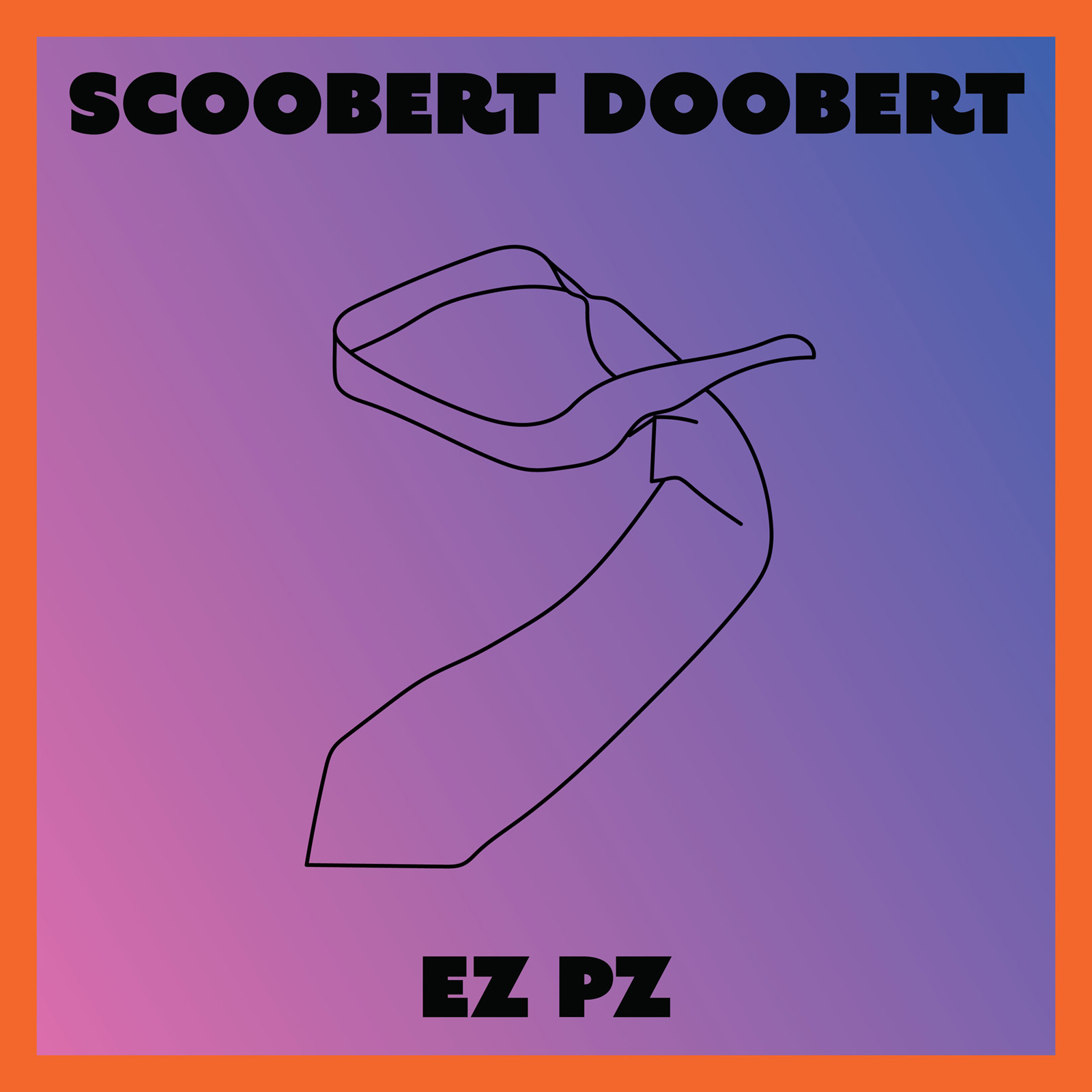
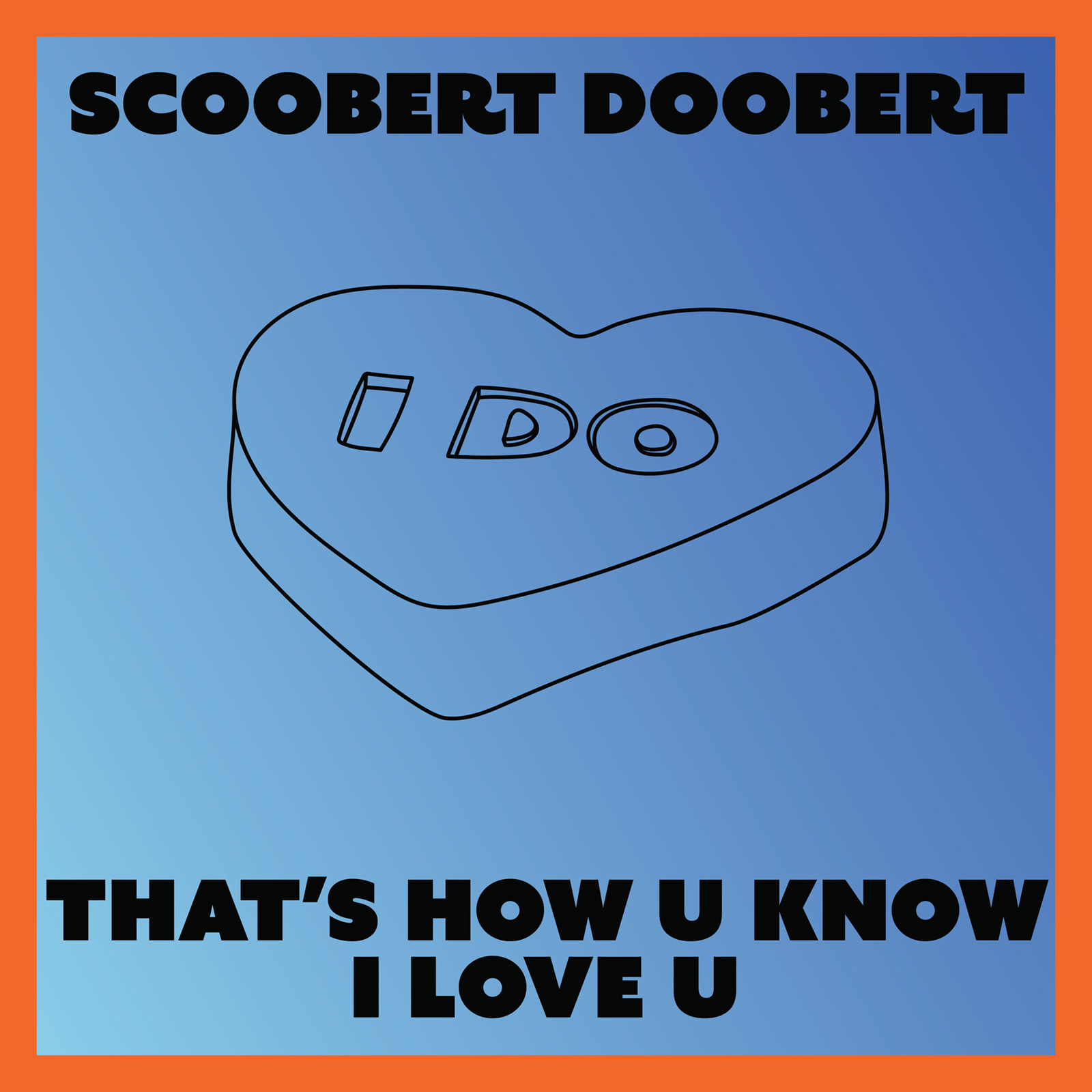
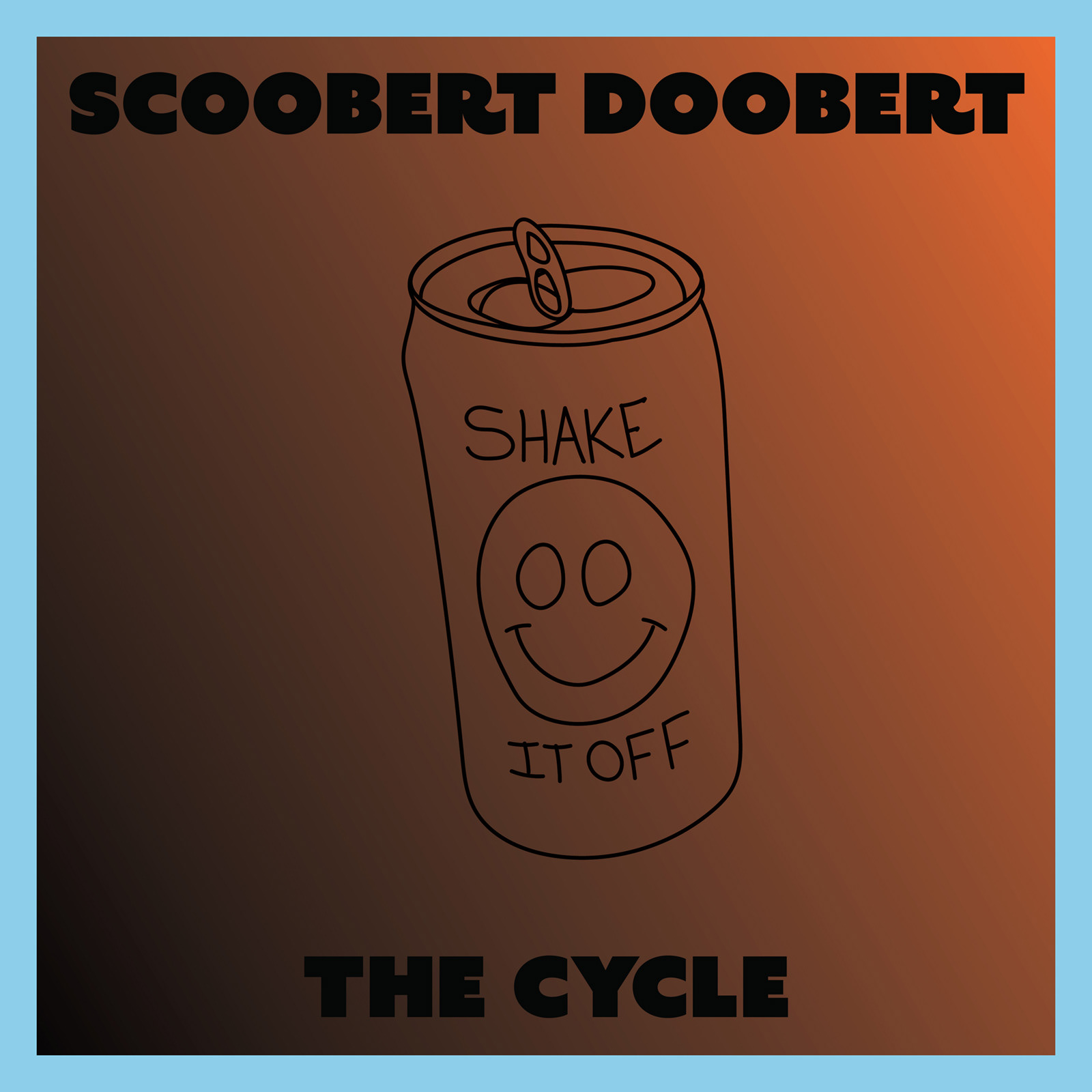
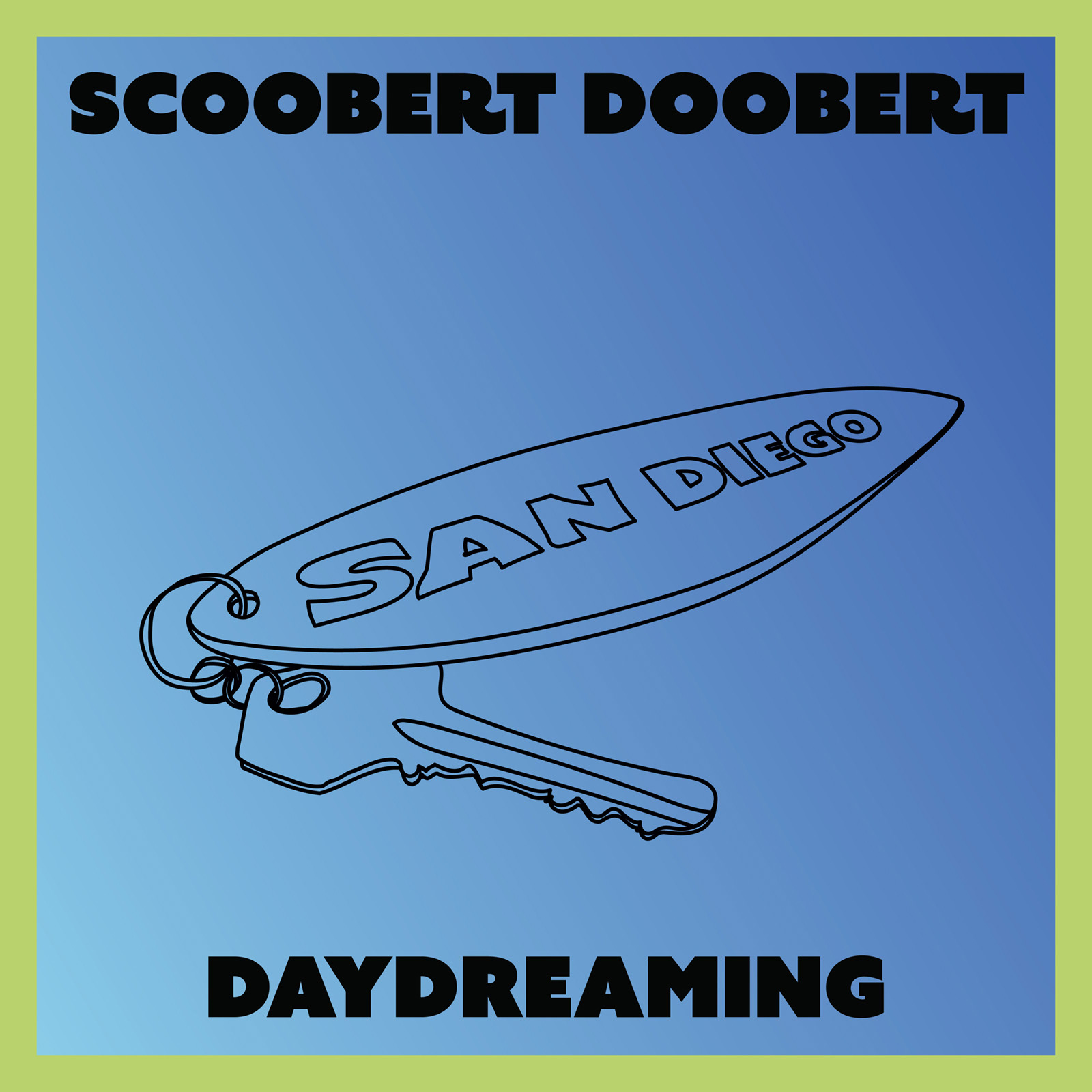
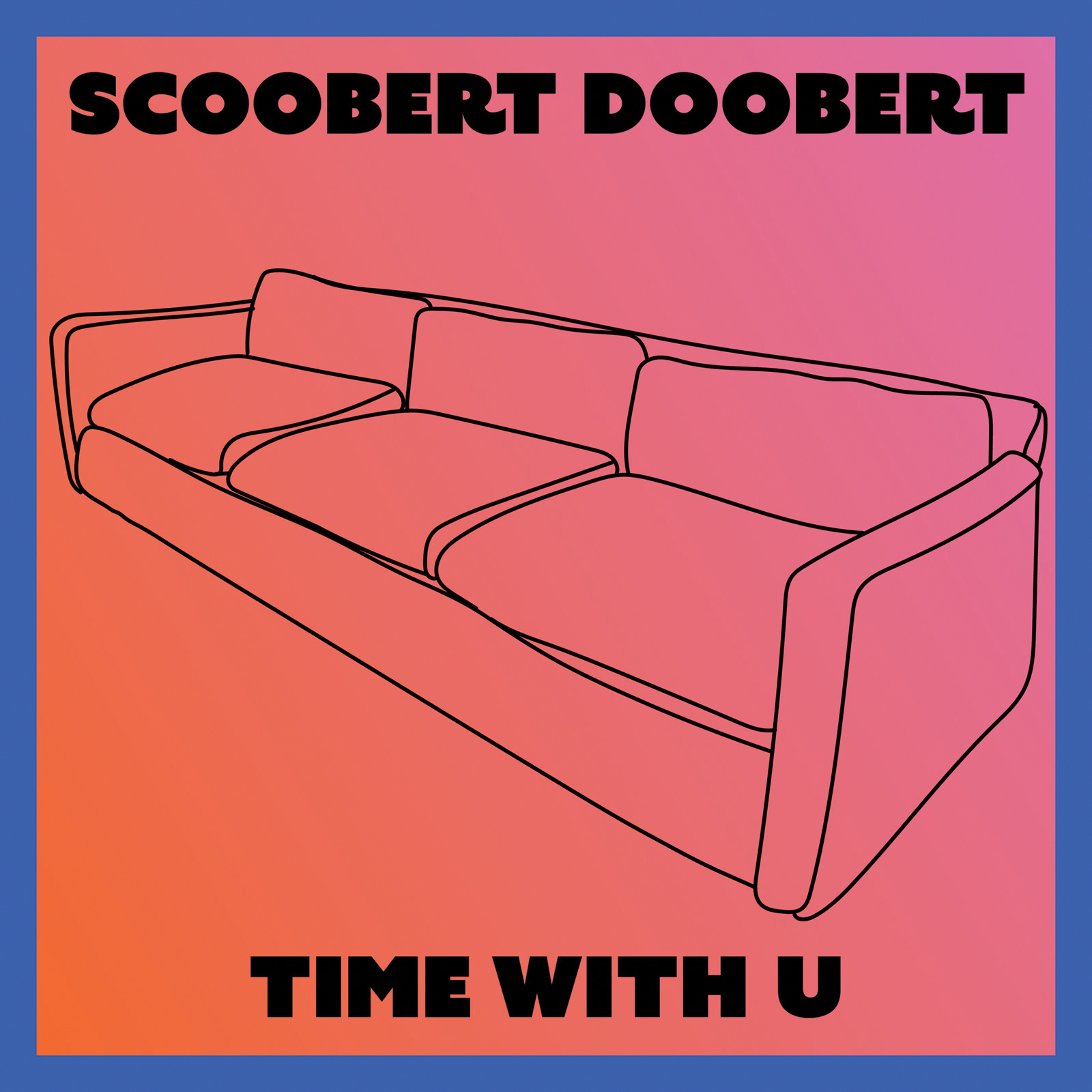
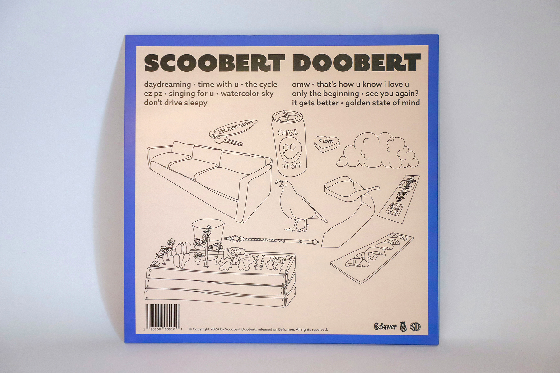
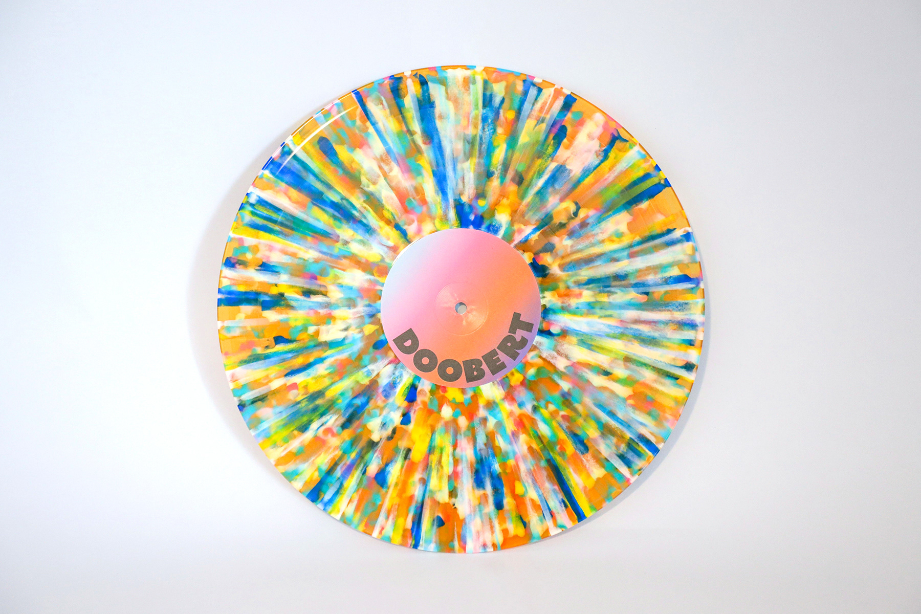
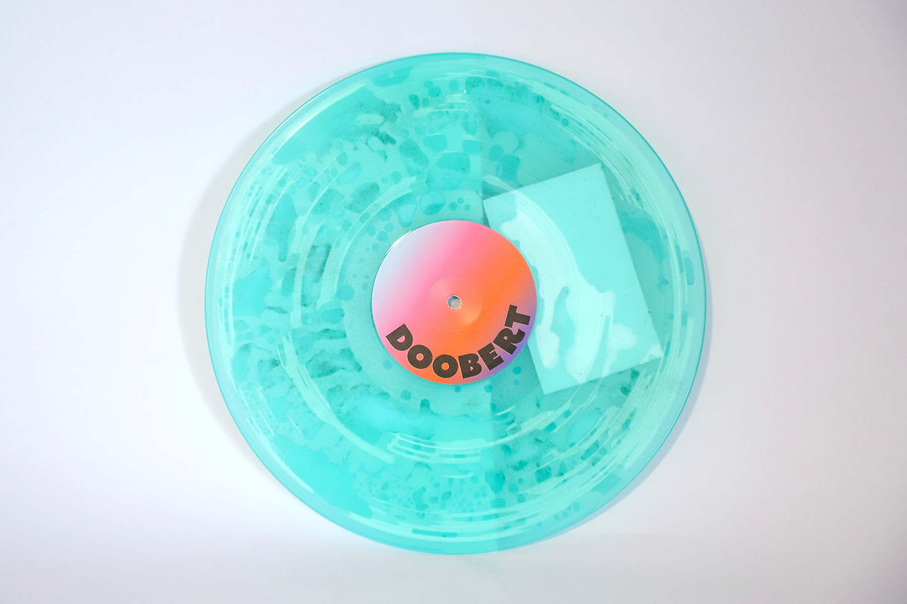
I (2024)
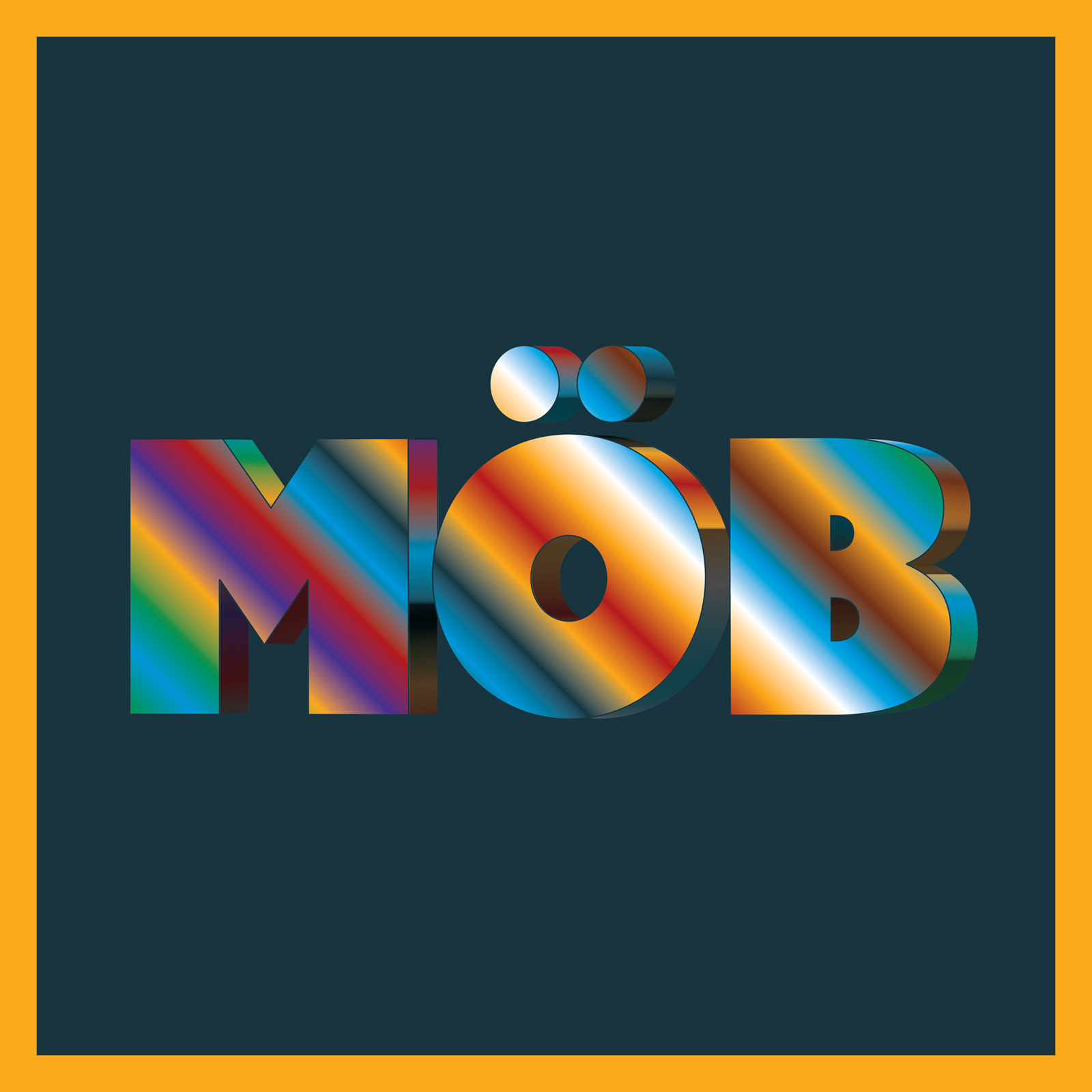
I expands on the visual system established in Möb while presenting it through a new artistic approach. The object-based concept remains, but each illustration is simplified into clean line art while maintaining the same limited color philosophy. The palette from Möb was inverted for I, with each single mirroring the corresponding release from the first album. For example, the yellow border of the first Möb single becomes the blue border of Time With U. The album cover follows the same inversion, placing the color gradient outside the typography rather than within it.
SINGLES
VINYL RELEASE

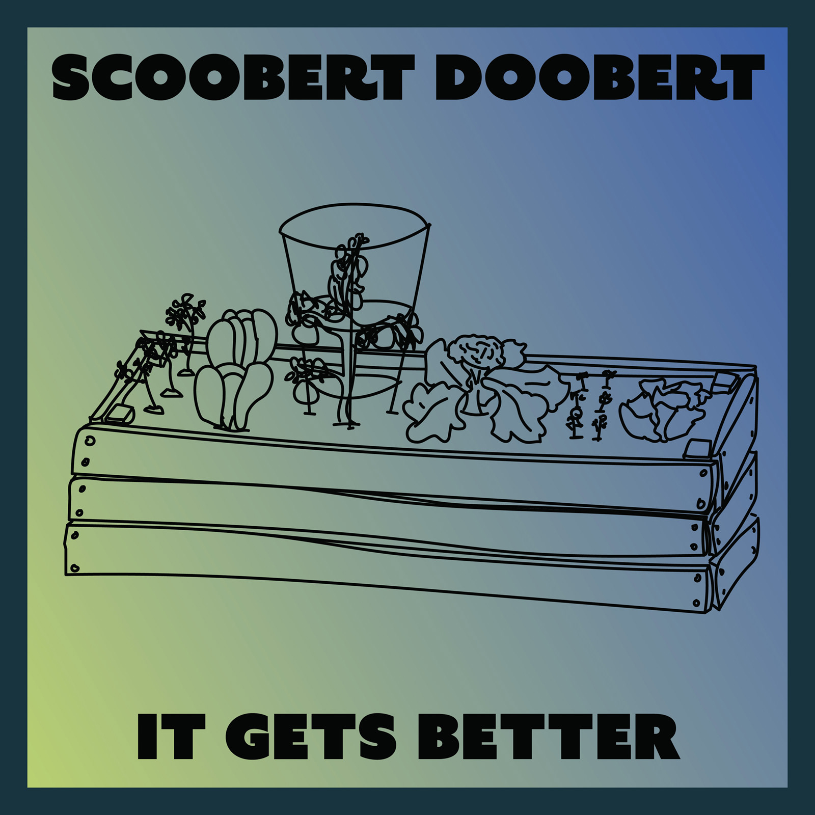
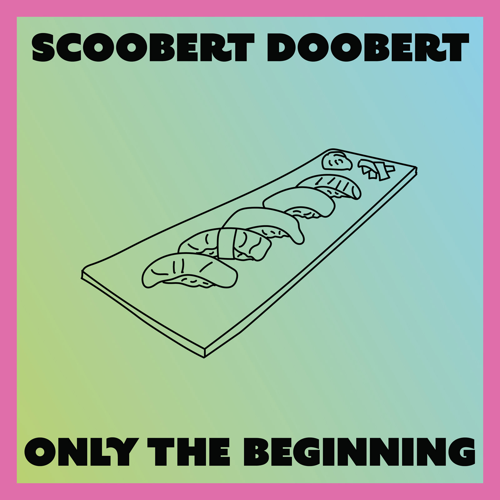
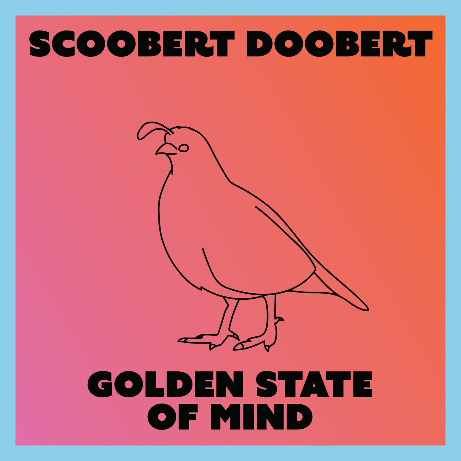
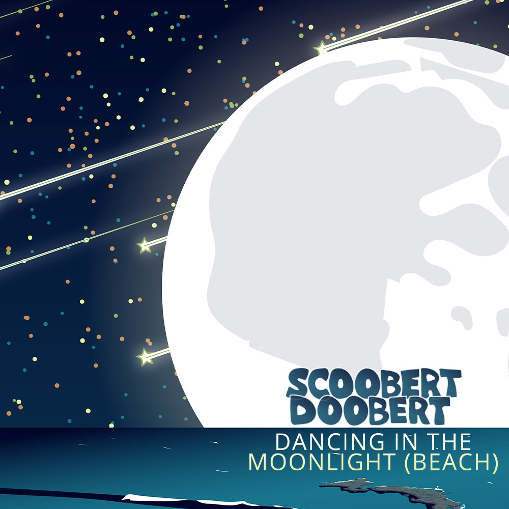
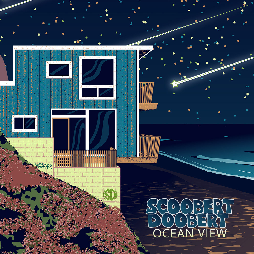
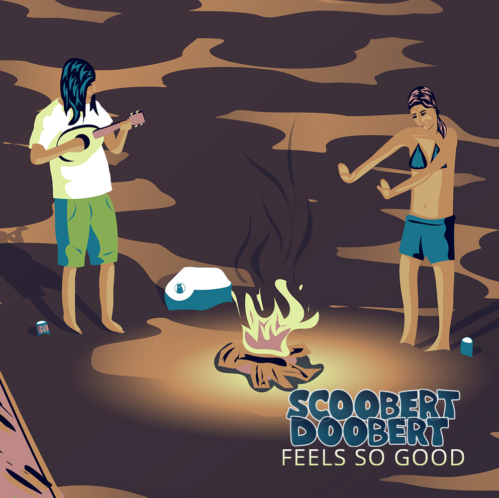
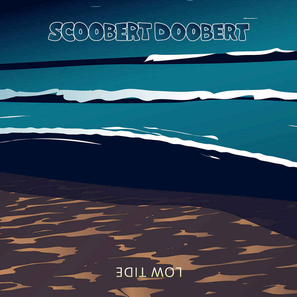
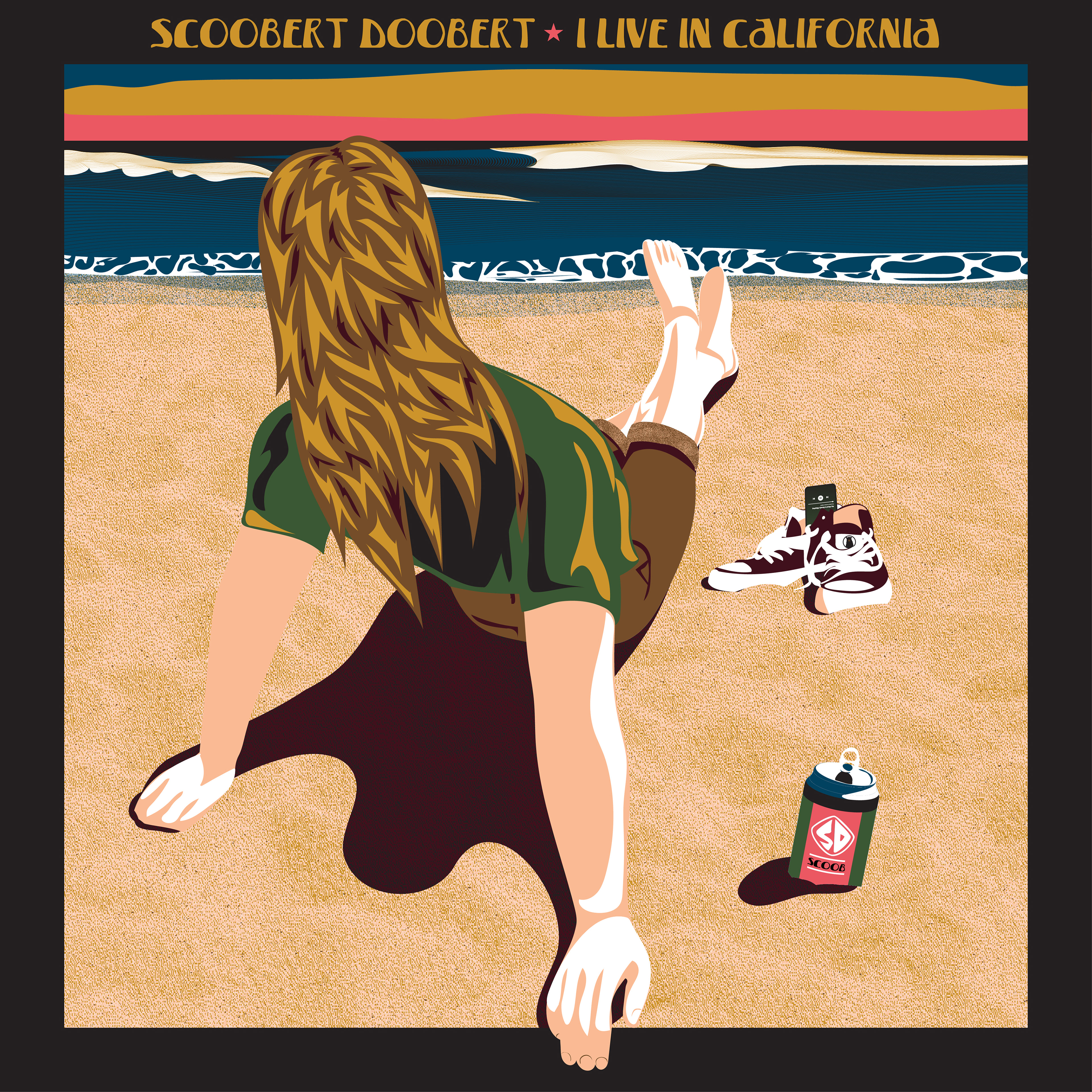
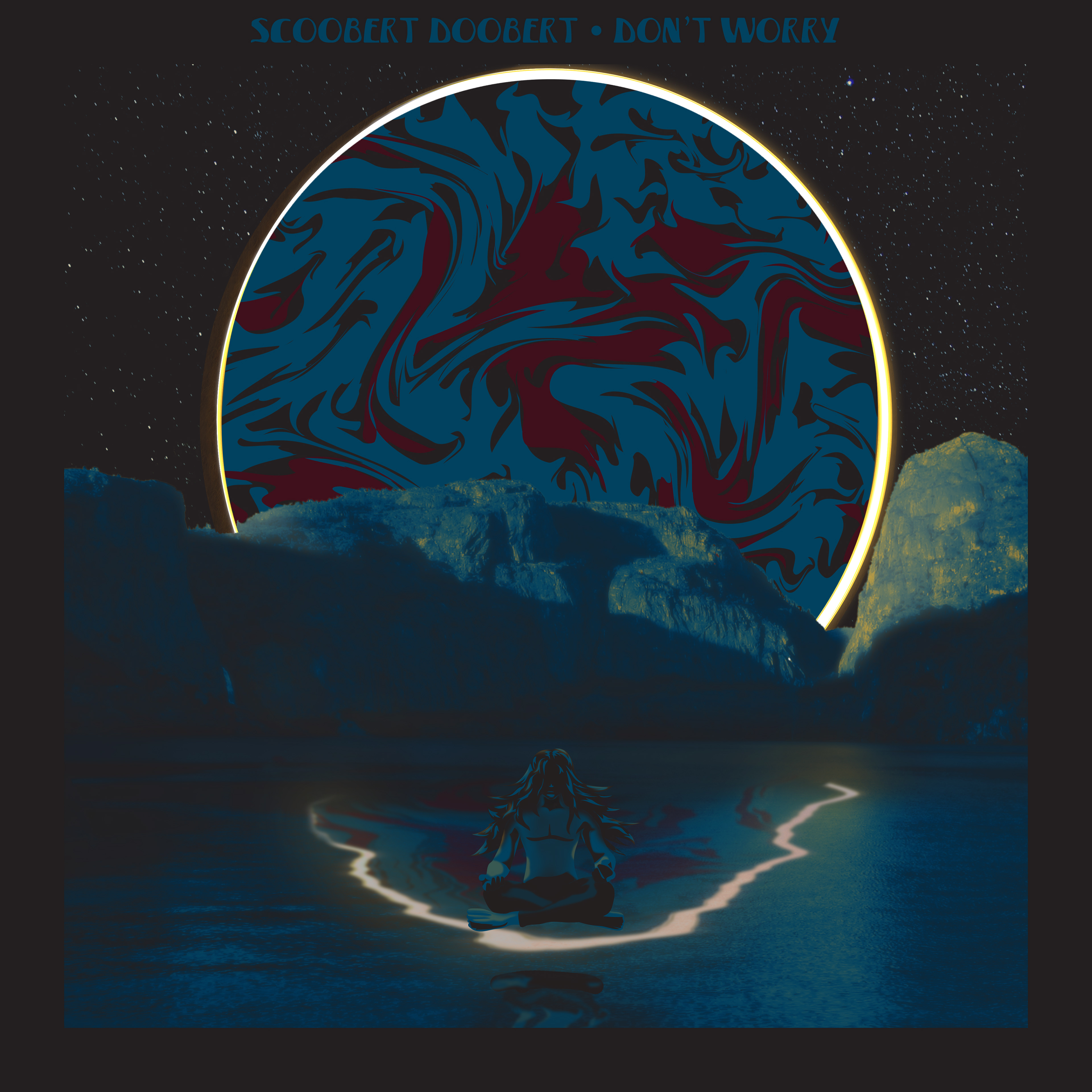
Moonlight Beach (2023)
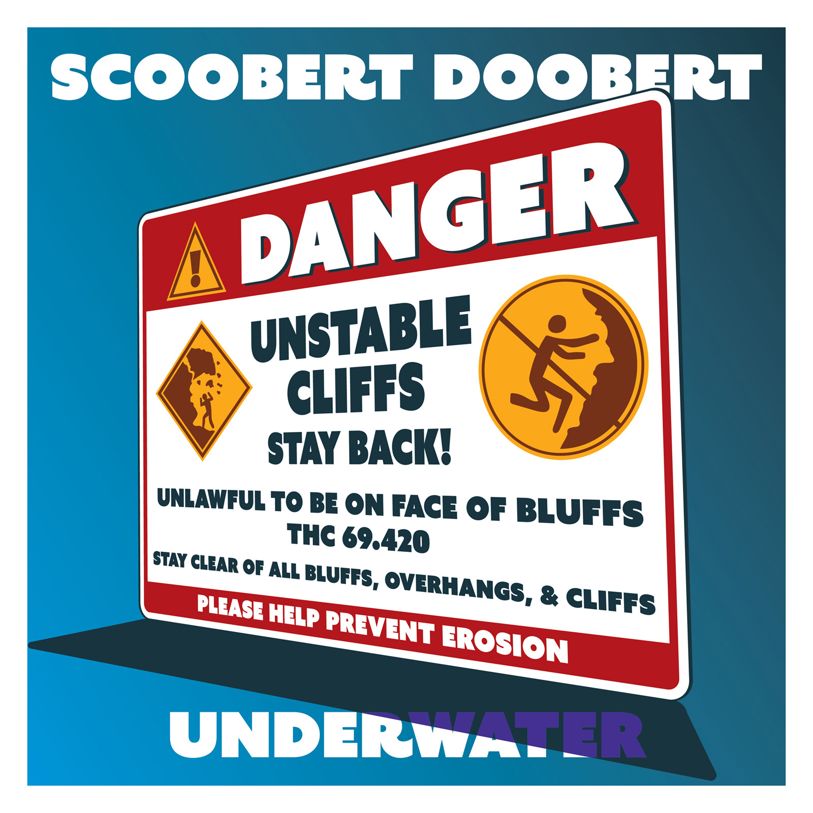
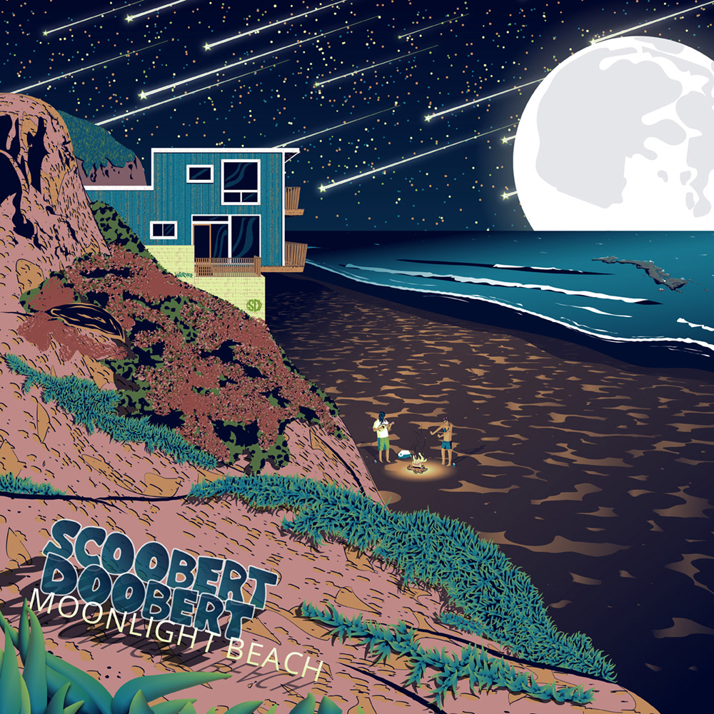
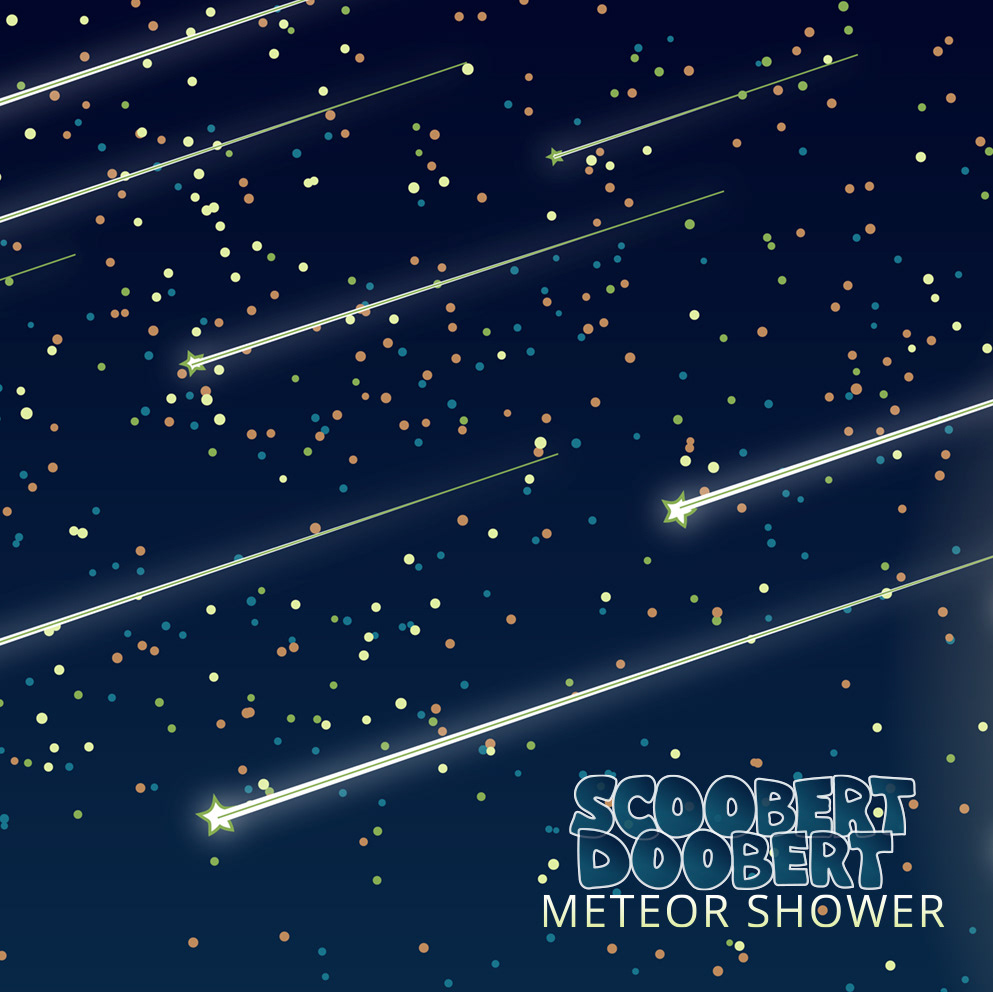
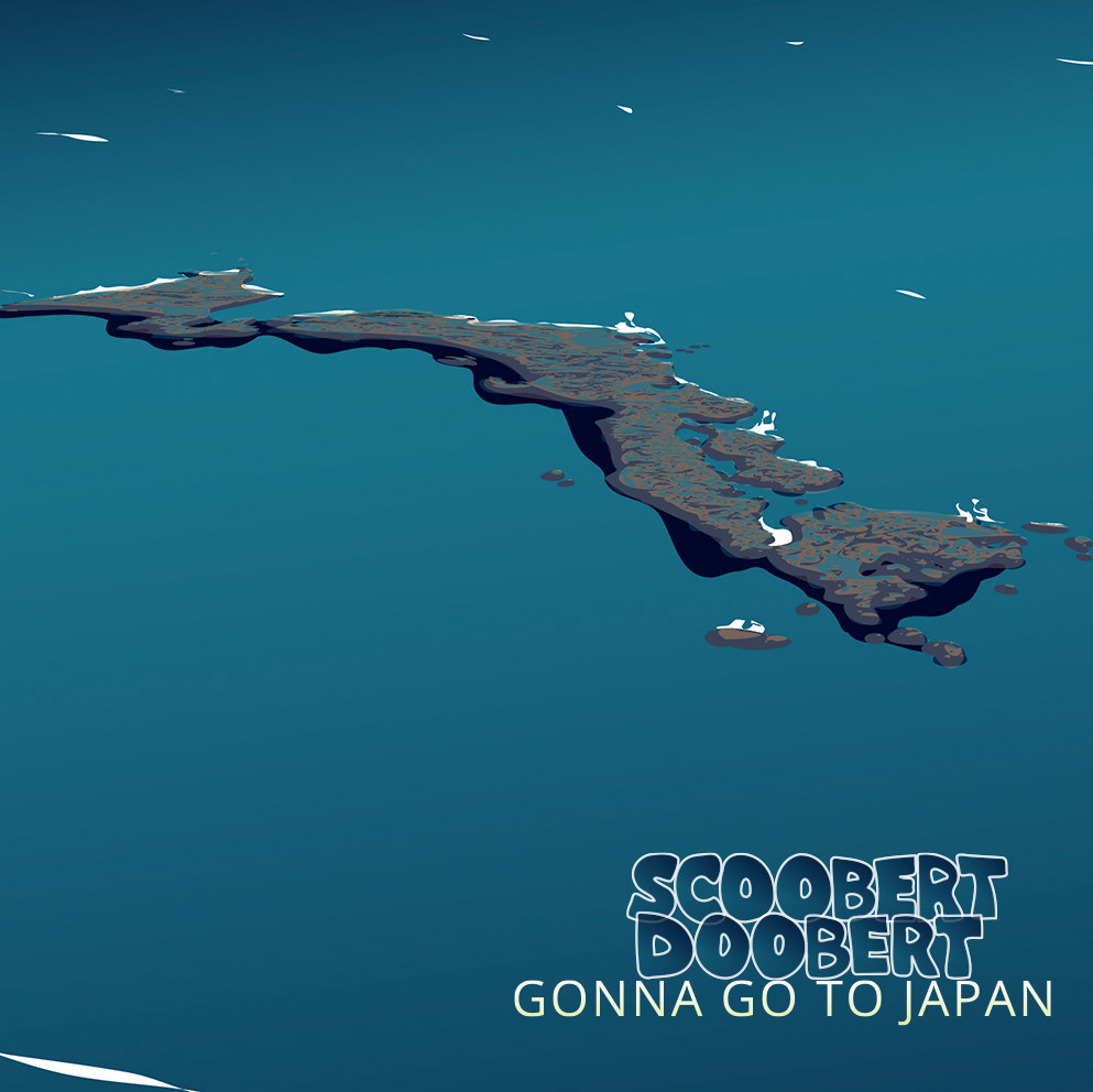
The Moonlight Beach album cycle draws inspiration from the real Moonlight Beach in Encinitas, California, transforming the familiar landscape into a complete visual gestalt that celebrates each song on the album. Hidden throughout the illustration are references to the individual singles, with every object serving as a visual callback to a specific release. The beach house represents Ocean View, while the offshore rock formation is shaped like Japan, referencing Gonna Go to Japan. Together, these details reward closer inspection while reinforcing the connection between the album artwork and its accompanying singles.
SINGLES

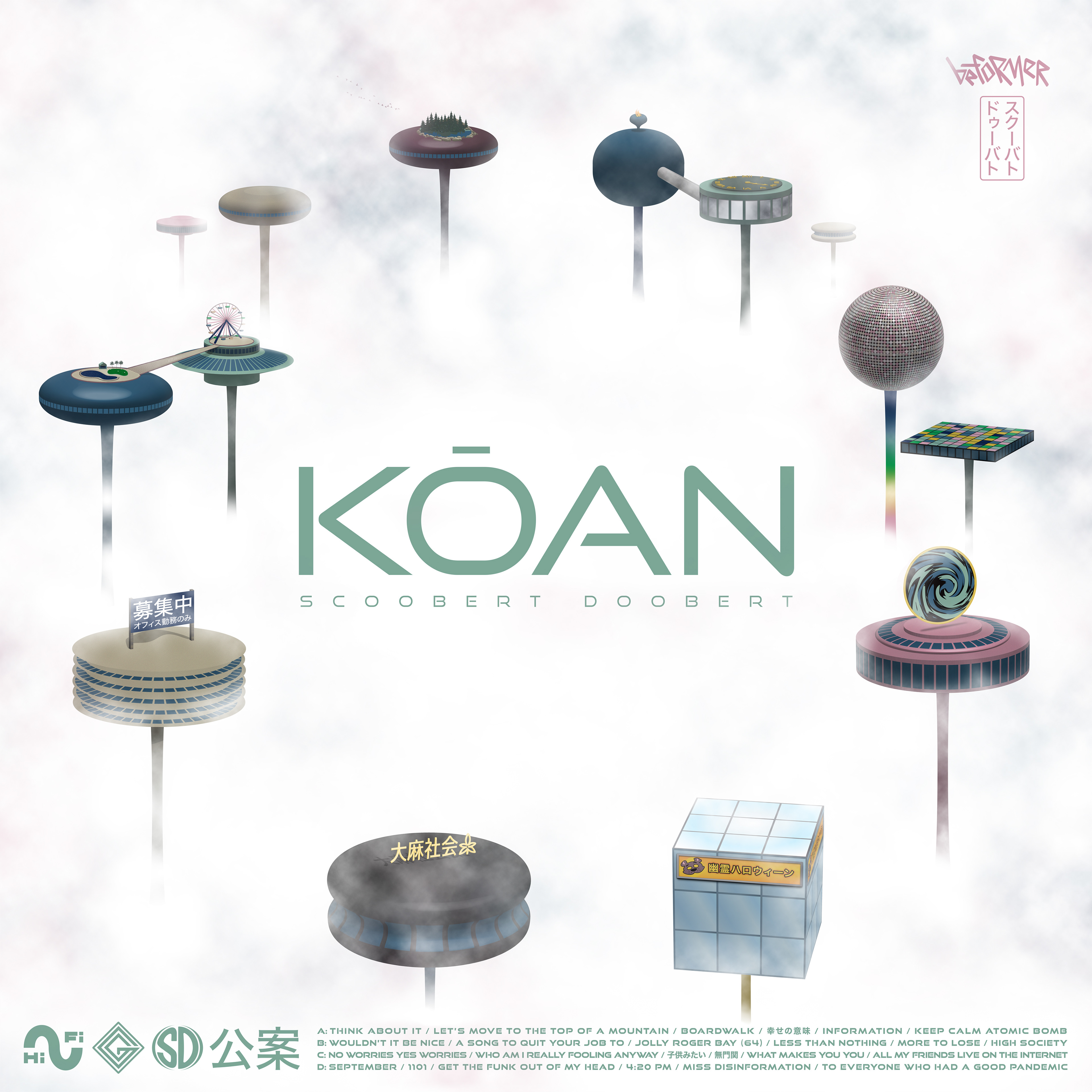
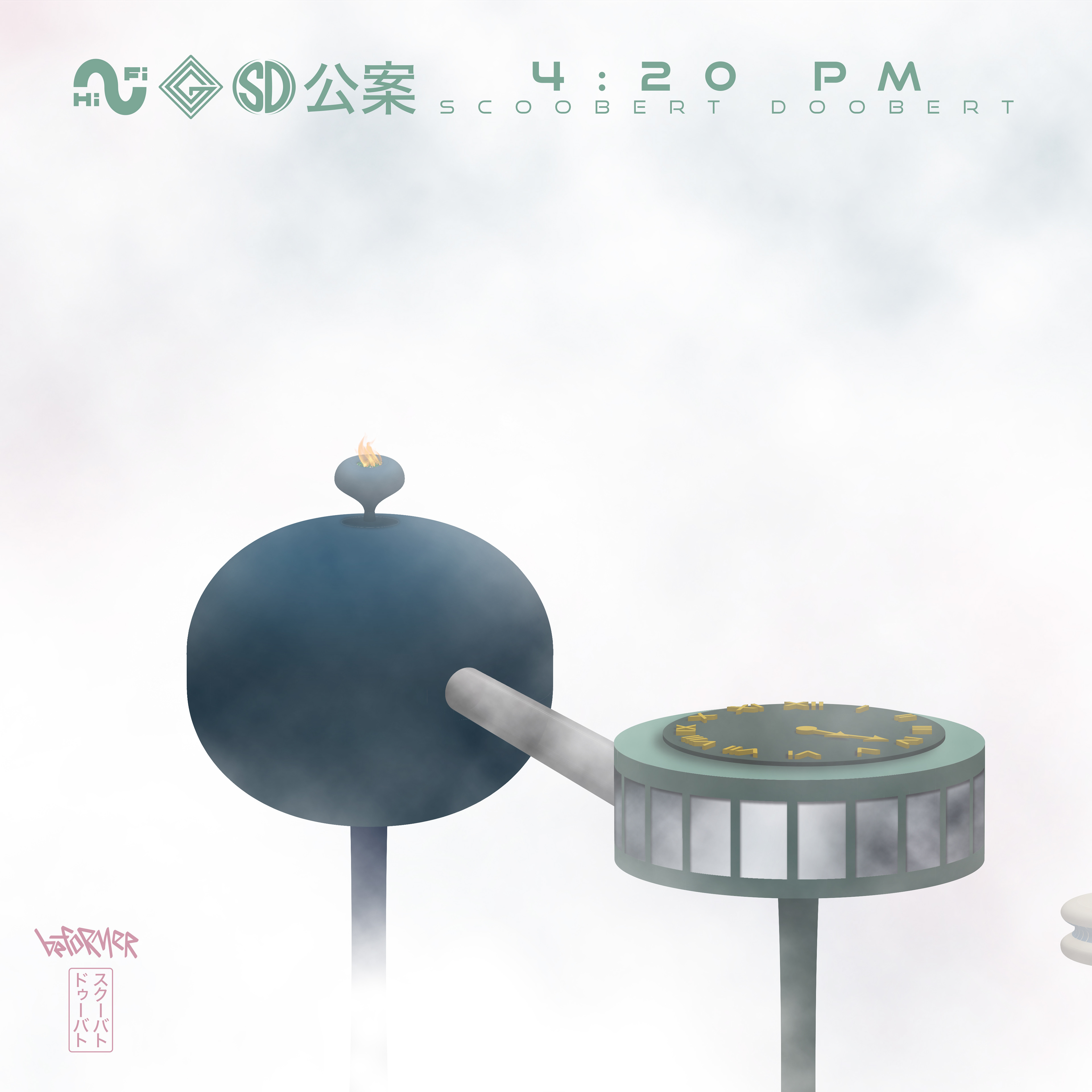
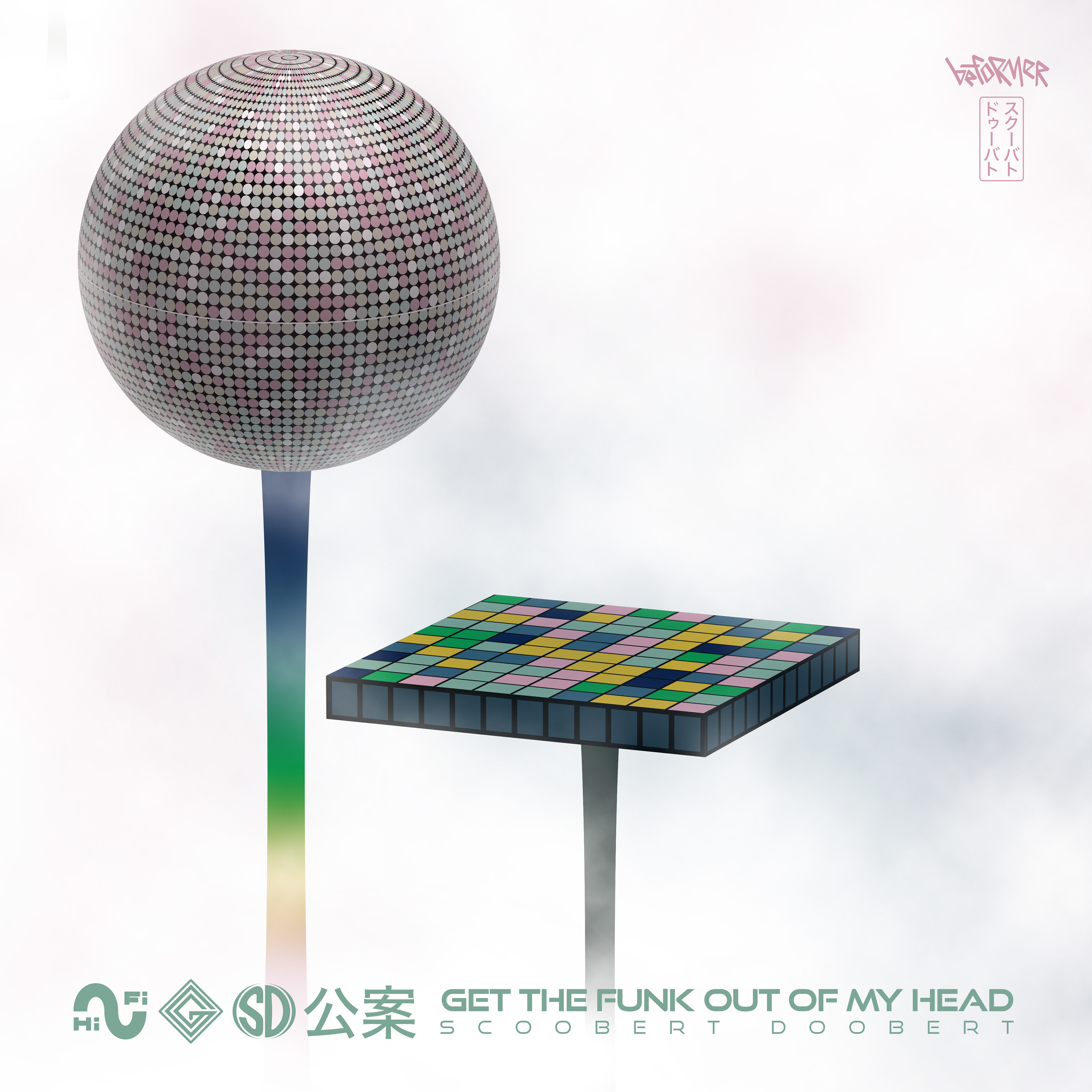
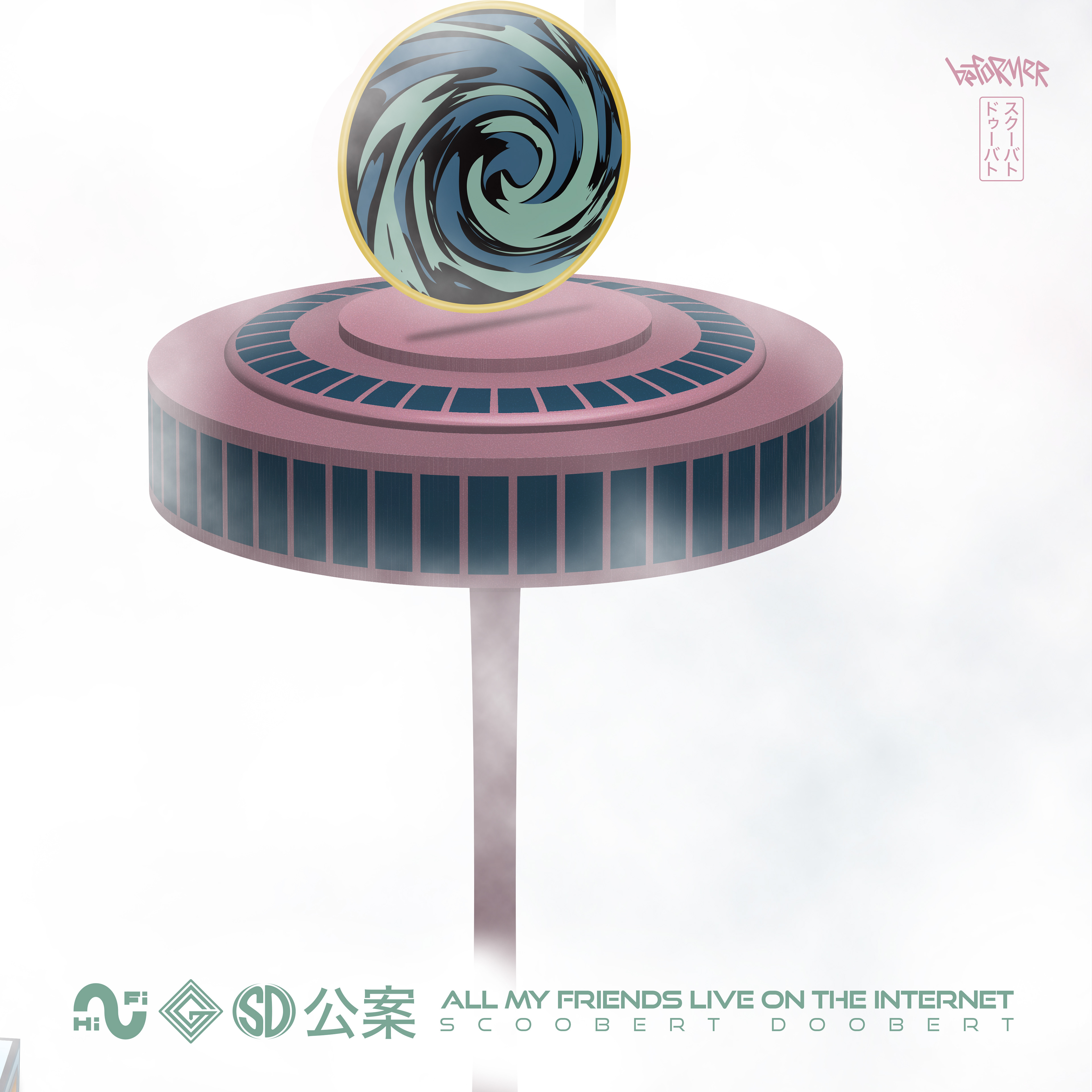
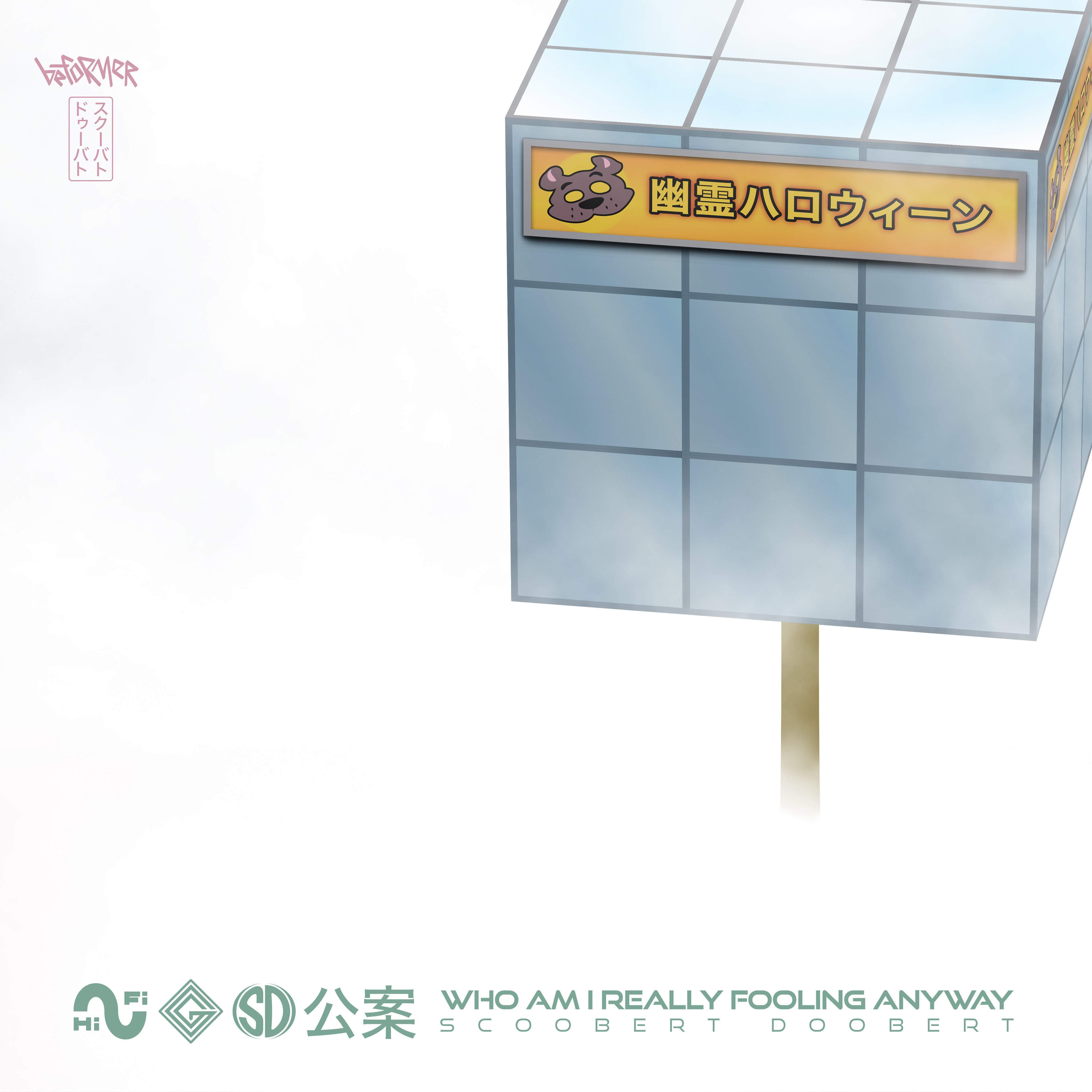
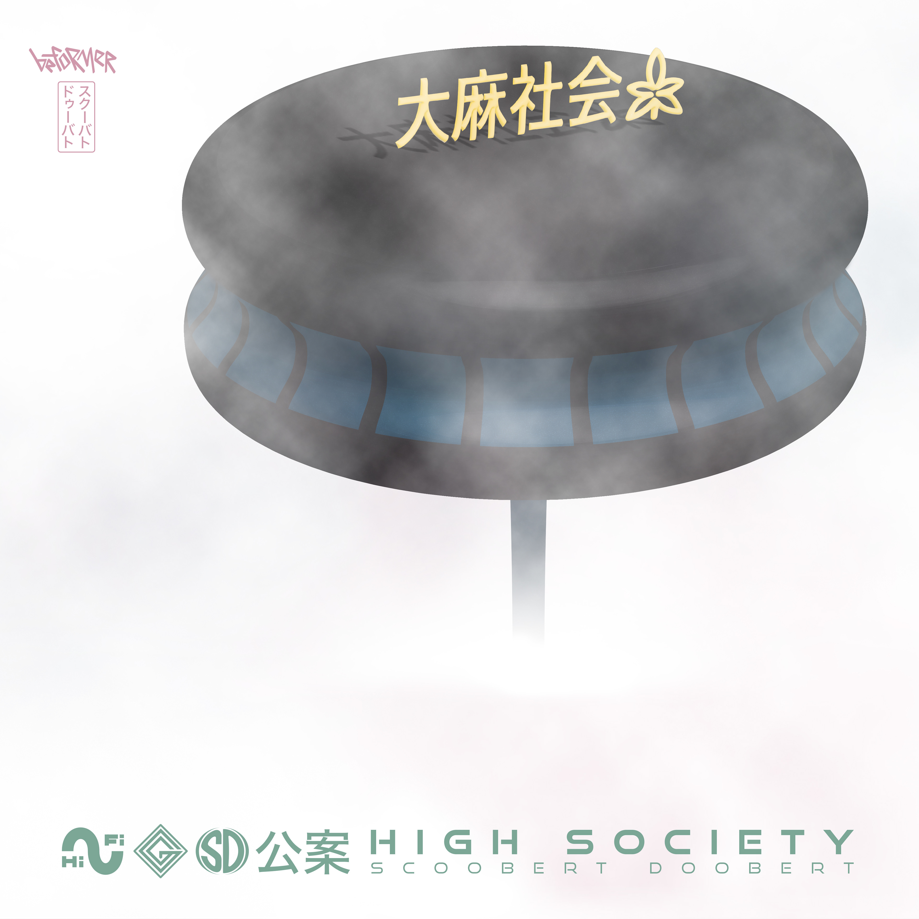
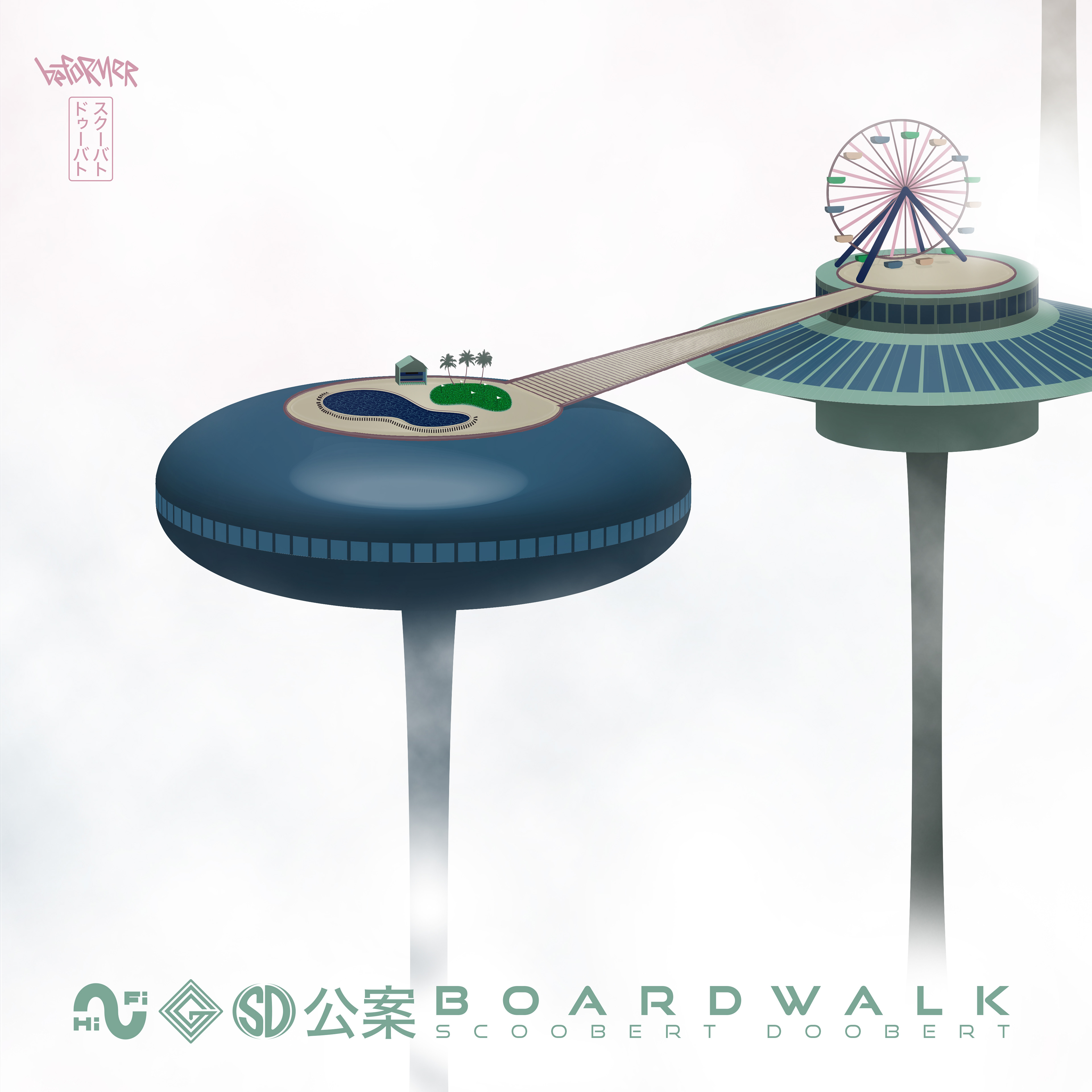
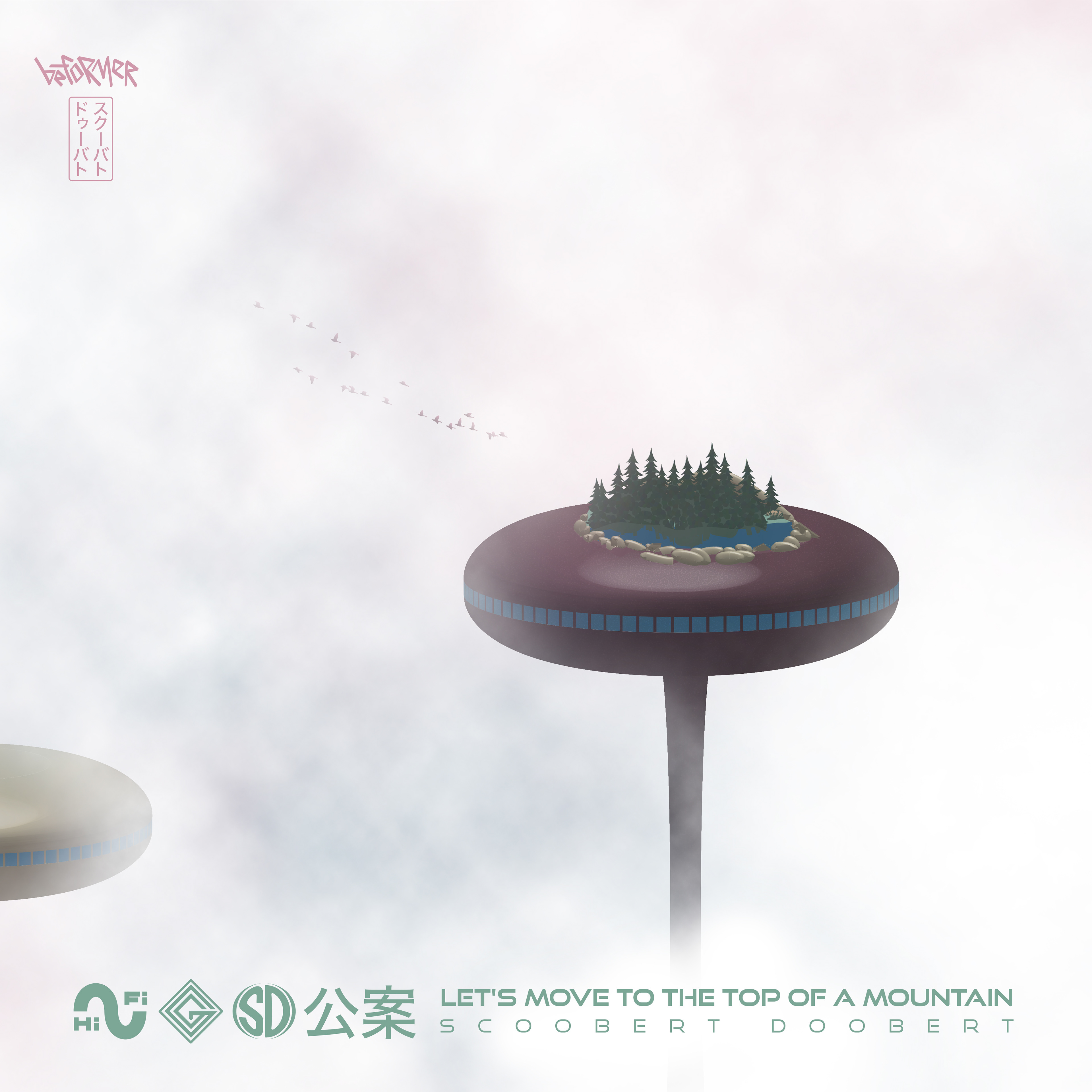
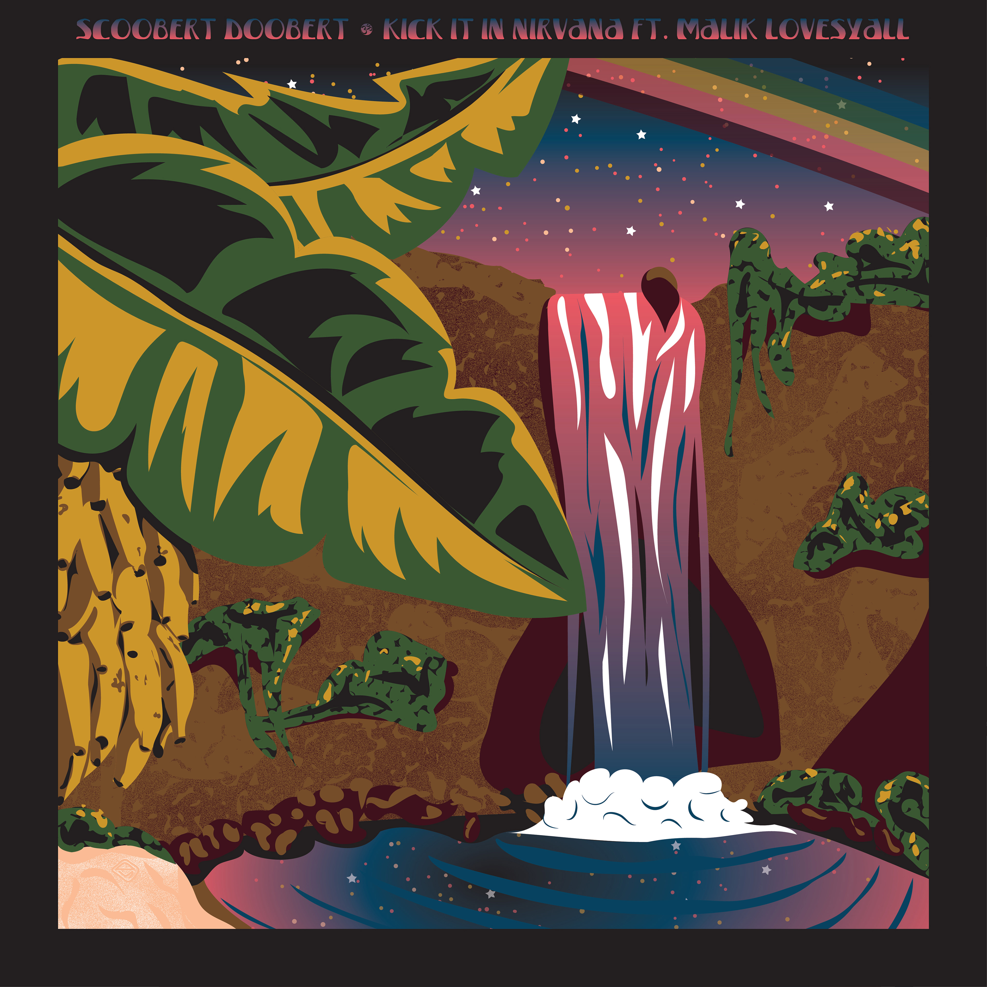
KŌAN (2022)
Inspired by the Zen concept of a KŌAN, a paradox used to challenge conventional thinking, the KŌAN album cycle was designed as a complete visual gestalt. Each single is represented by a unique building within a retrofuturist cityscape, creating an interconnected composition that loops back on itself with no true beginning or end. Drawing from Japanese influences and the optimistic aesthetic of mid-century retrofuturism, the artwork creates a cohesive visual identity that encourages the album to be experienced as a unified whole rather than a collection of individual songs.
SINGLES

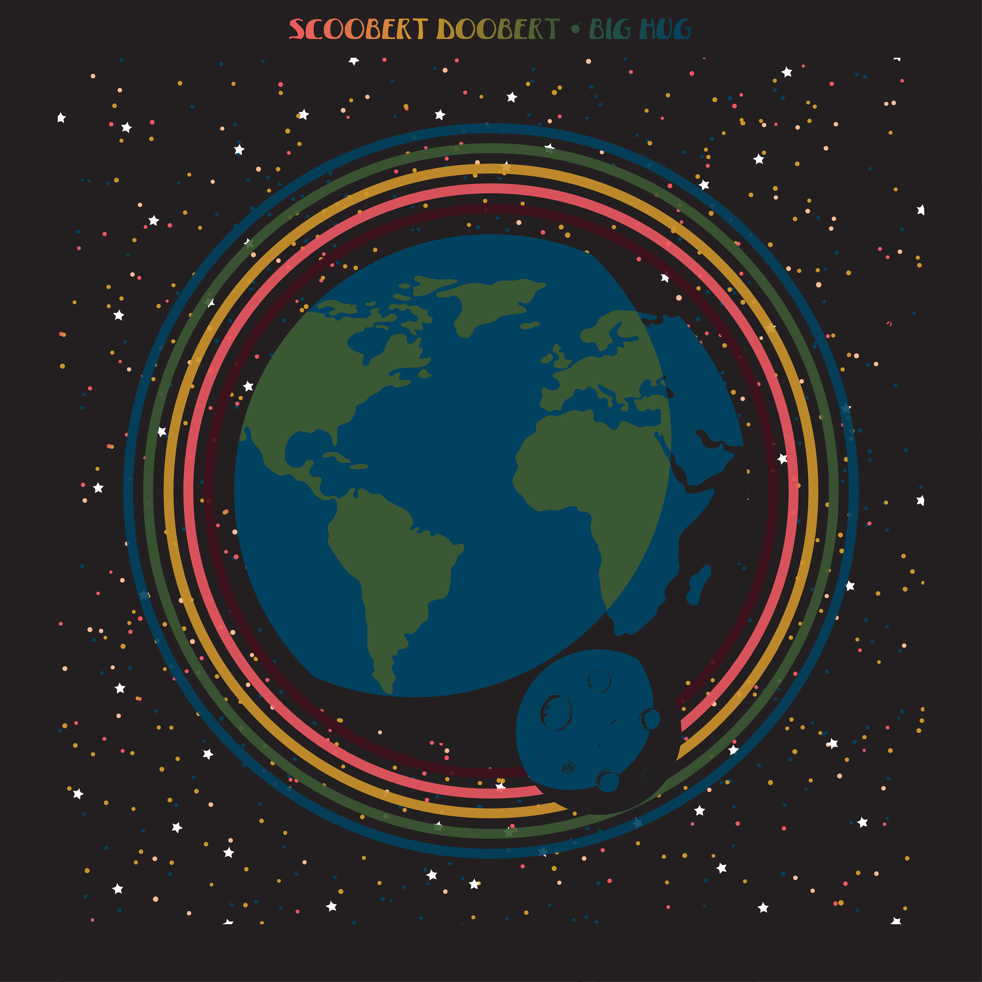
Big Hug (2021)
Big Hug and Little Hug were conceived as companion albums, with Big Hug expanding on the musical ideas introduced in Little Hug. To reinforce that relationship, both releases were built around the same visual system, sharing a consistent color palette, black border treatment, and typography integrated into the border of every cover. Each single illustration represents the theme of its song while maintaining the established design language. The Big Hug album cover brings the concept full circle, depicting a rainbow wrapping around the Earth to symbolize the album's central message of unity, connection, and embracing the world with one big hug.
SINGLES

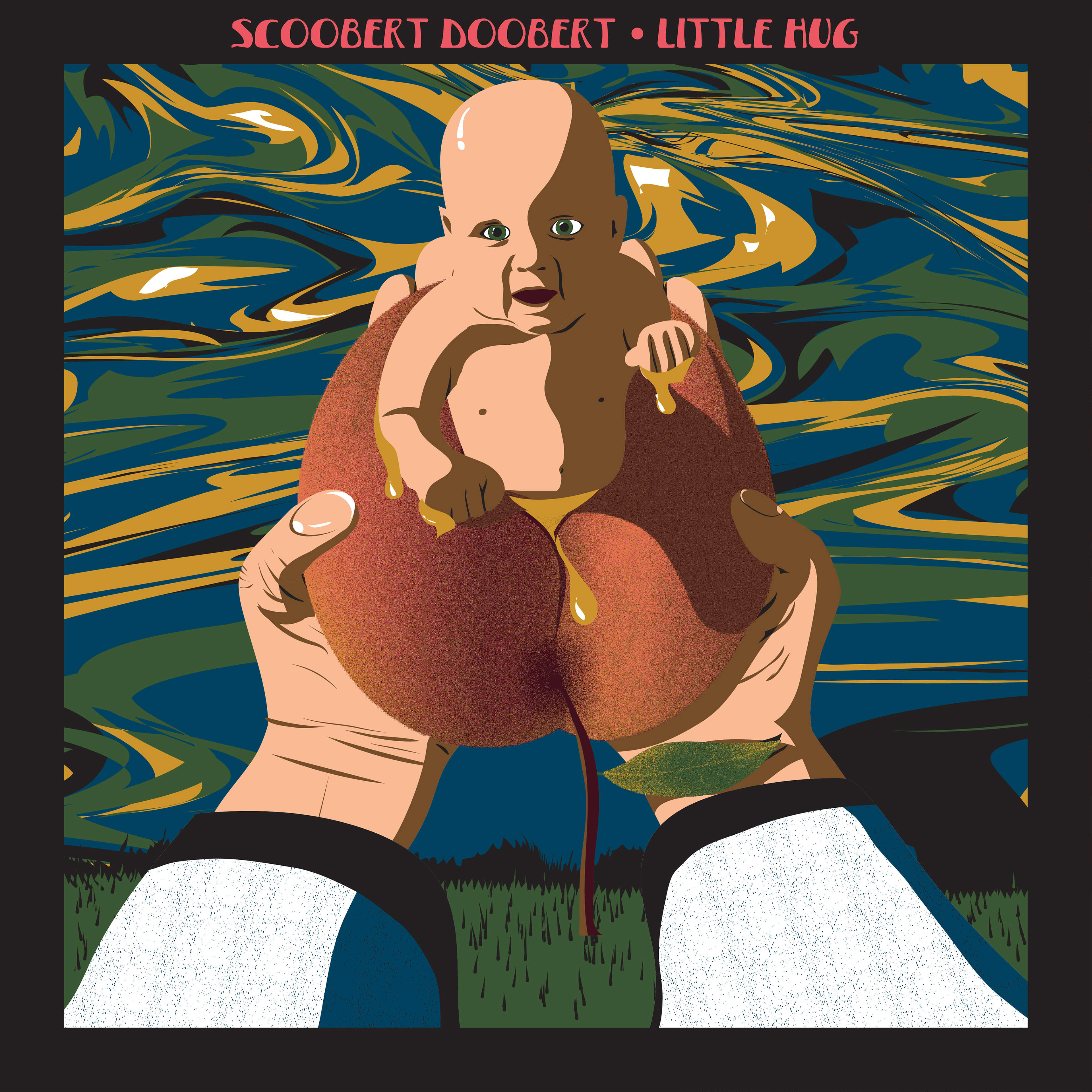
Little Hug (2021)
The Little Hug album cover draws inspiration from the Japanese folktale Momotarō, in which a child emerges from a giant peach after being sent from the heavens. Rather than illustrating the story directly, I reinterpreted it through the album's central theme of family and connection. A baby emerging from the peach reaches out to embrace its parent with a "little hug," symbolizing the beginning of a lifelong bond. This concept established the visual language that would later expand into its companion album, Big Hug.
SINGLES
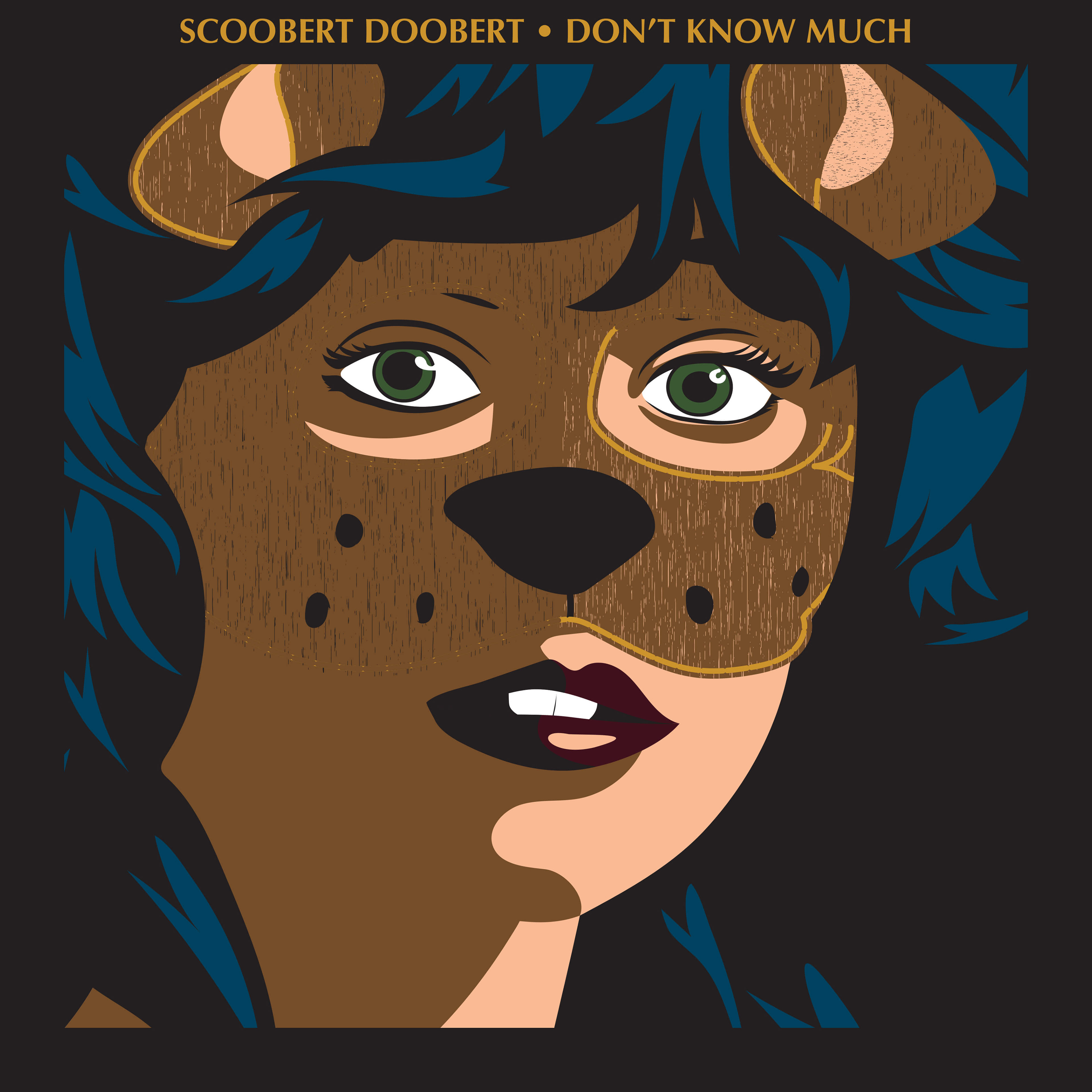

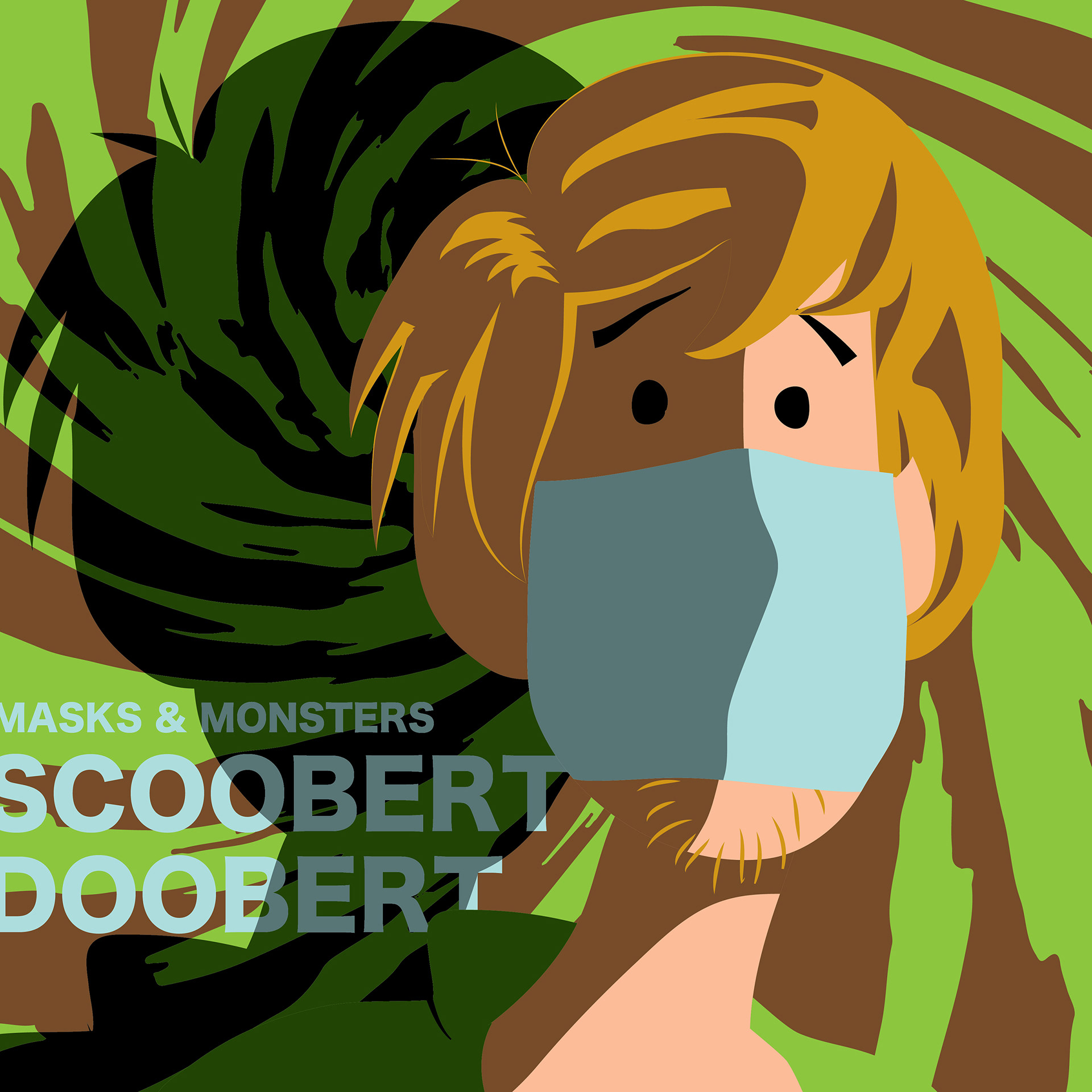
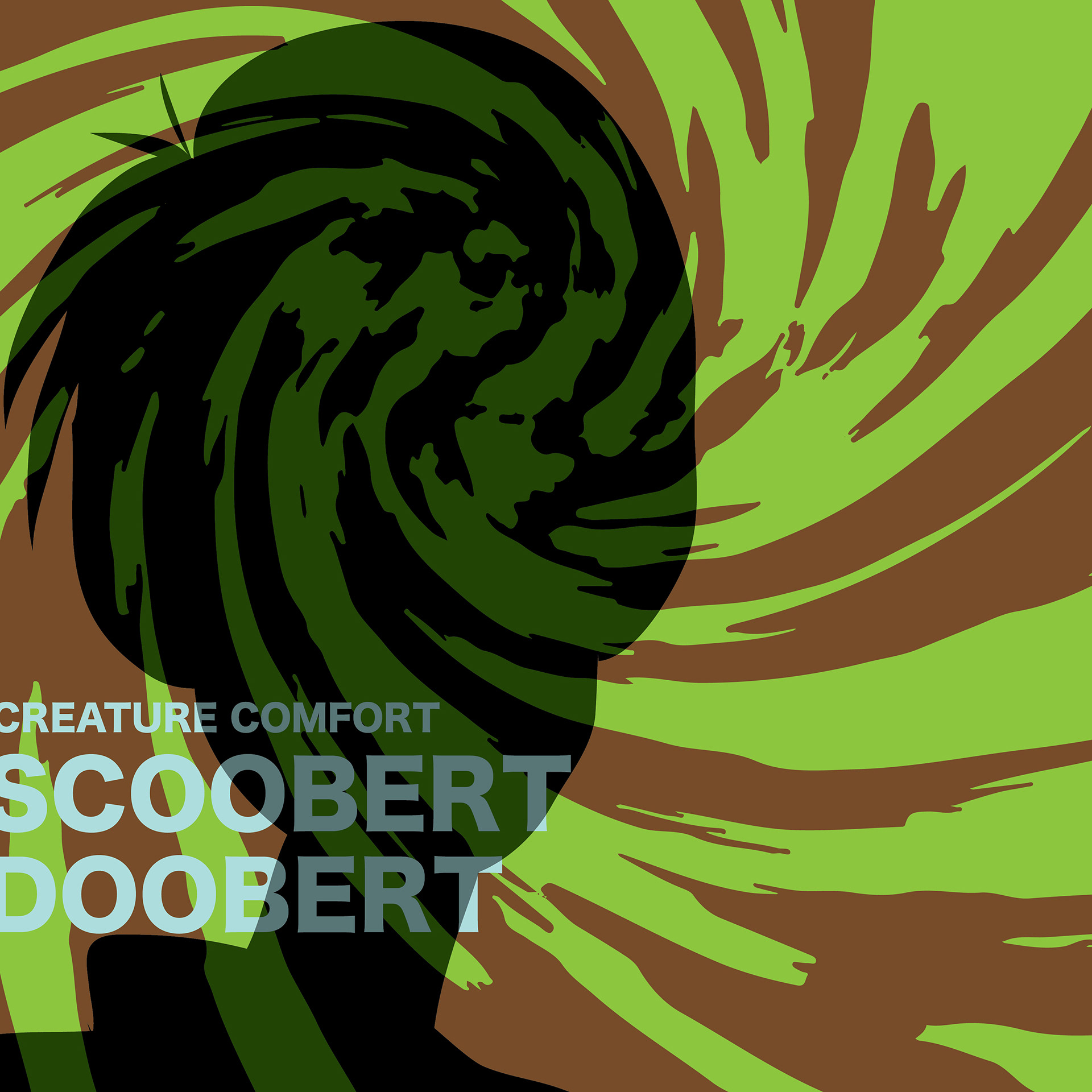
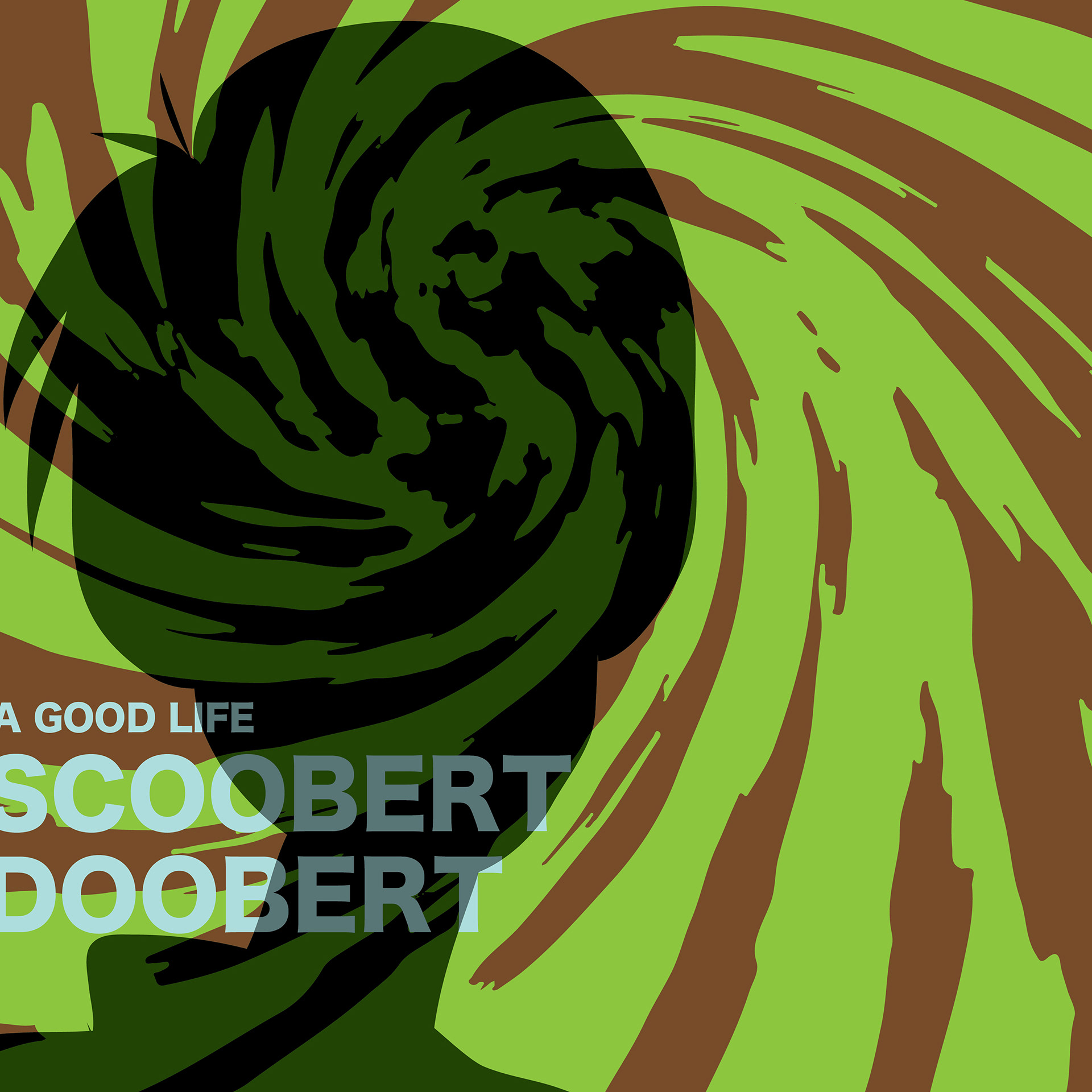
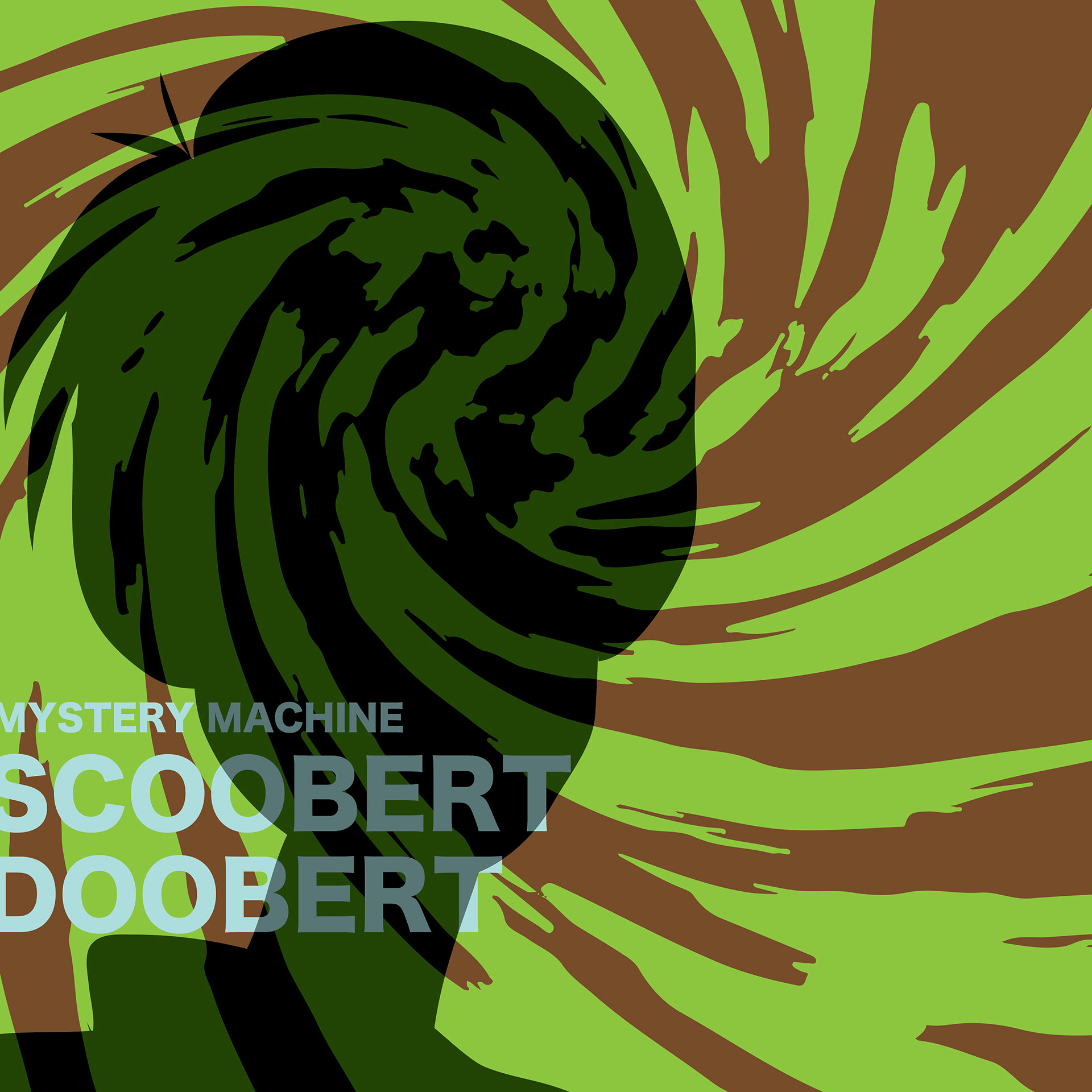
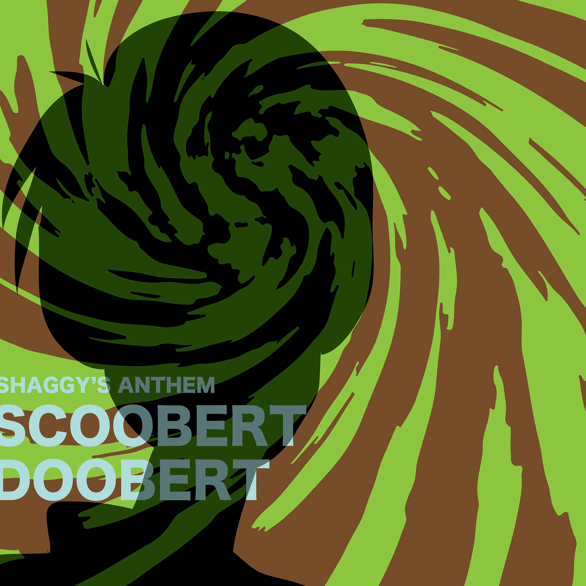
Masks & Monsters (2020)
Created during the height of the COVID-19 pandemic, Masks & Monsters reflects the uncertainty and isolation of that moment in time. The album cover depicts Shaggy from Scooby-Doo wearing a protective face mask, grounding the artwork in a shared cultural experience. Behind him, swirling green and brown forms symbolize the invisible spread of disease, creating an unsettling atmosphere that reinforces the album's themes while contrasting with the playful familiarity of the character.
SINGLES

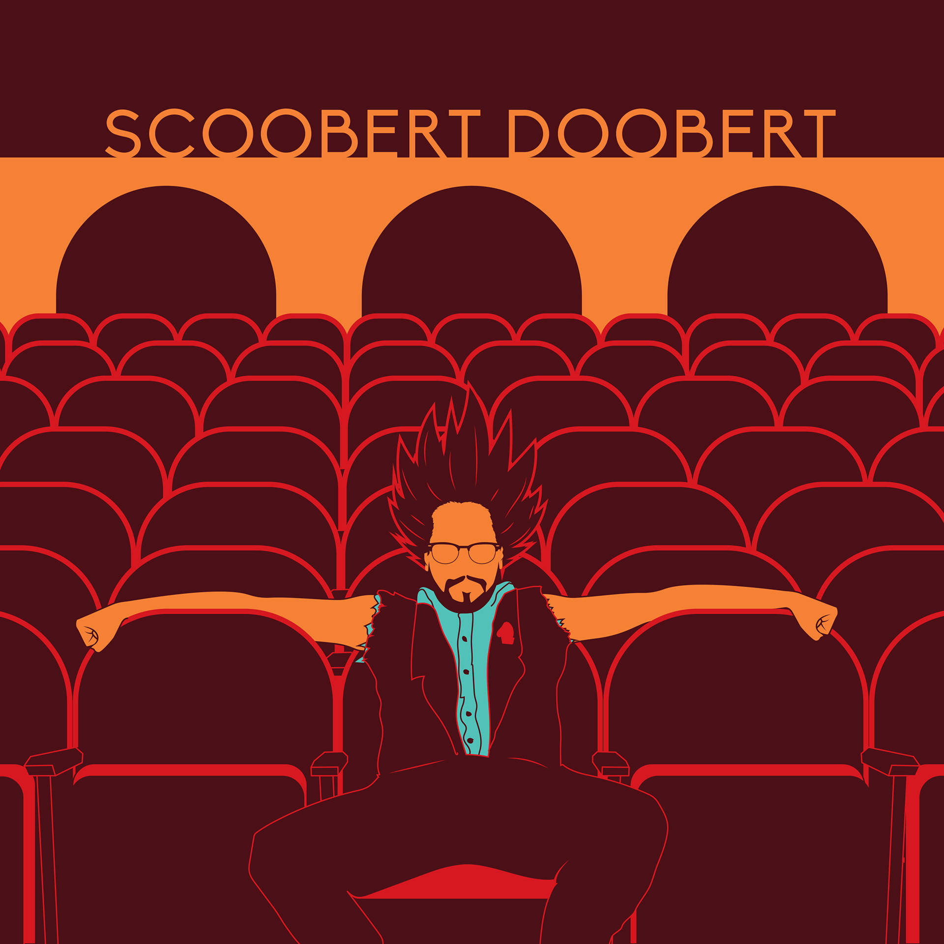
Dragon Ball $D (2020)
Dragon Ball $D was conceived as a rock-pop opera inspired by the world of Dragon Ball Z. Rather than recreating the show's visual style, I reimagined Scoobert Doobert as an original character existing within that universe. The album cover depicts him sitting alone in an empty opera house before the performance begins, setting the stage for a theatrical listening experience while blending anime-inspired storytelling with my own illustration style.

| Stand Alone Singles
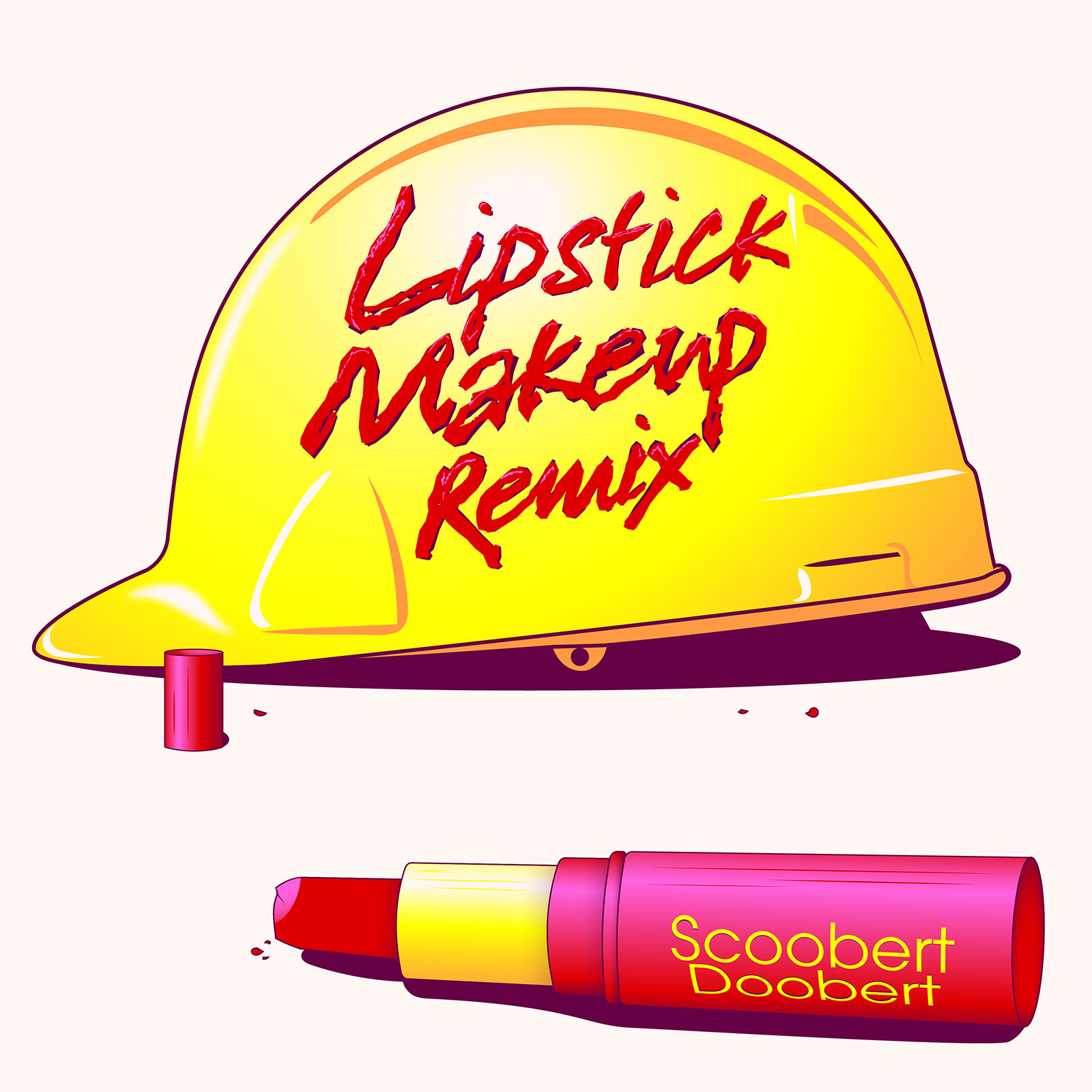
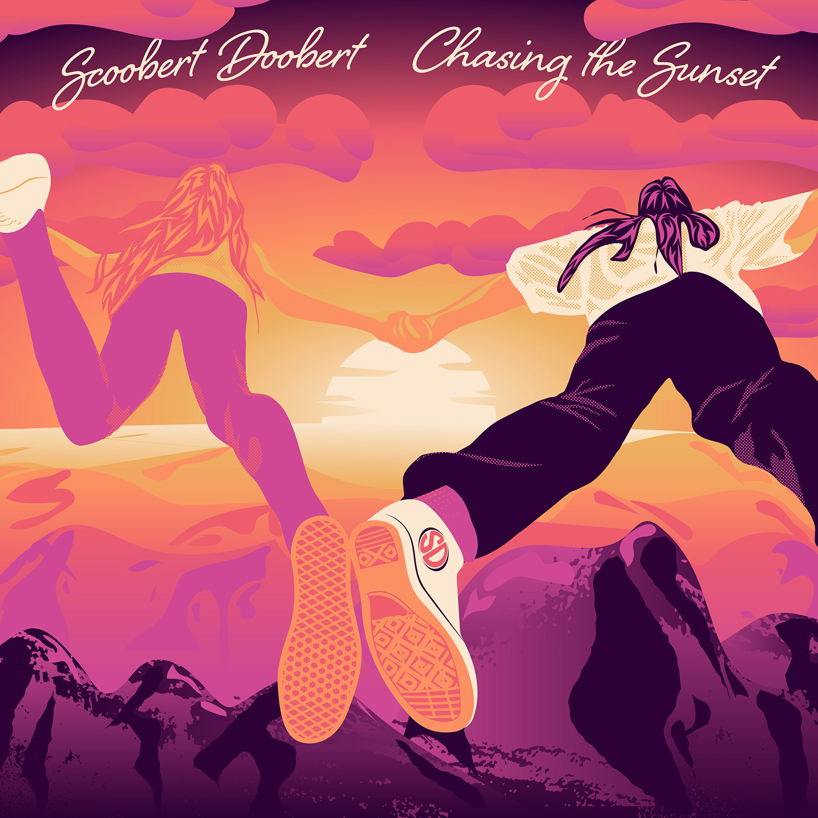
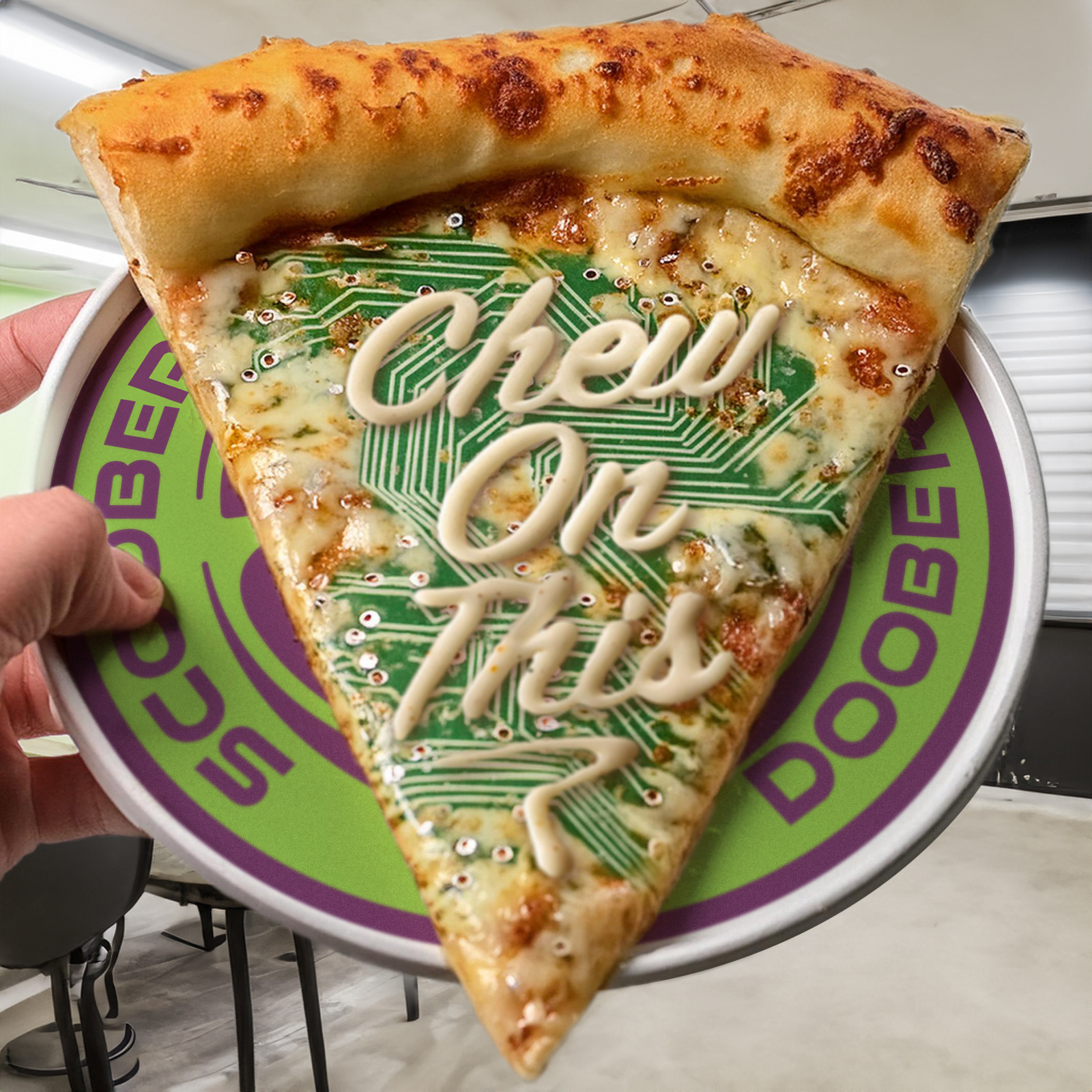
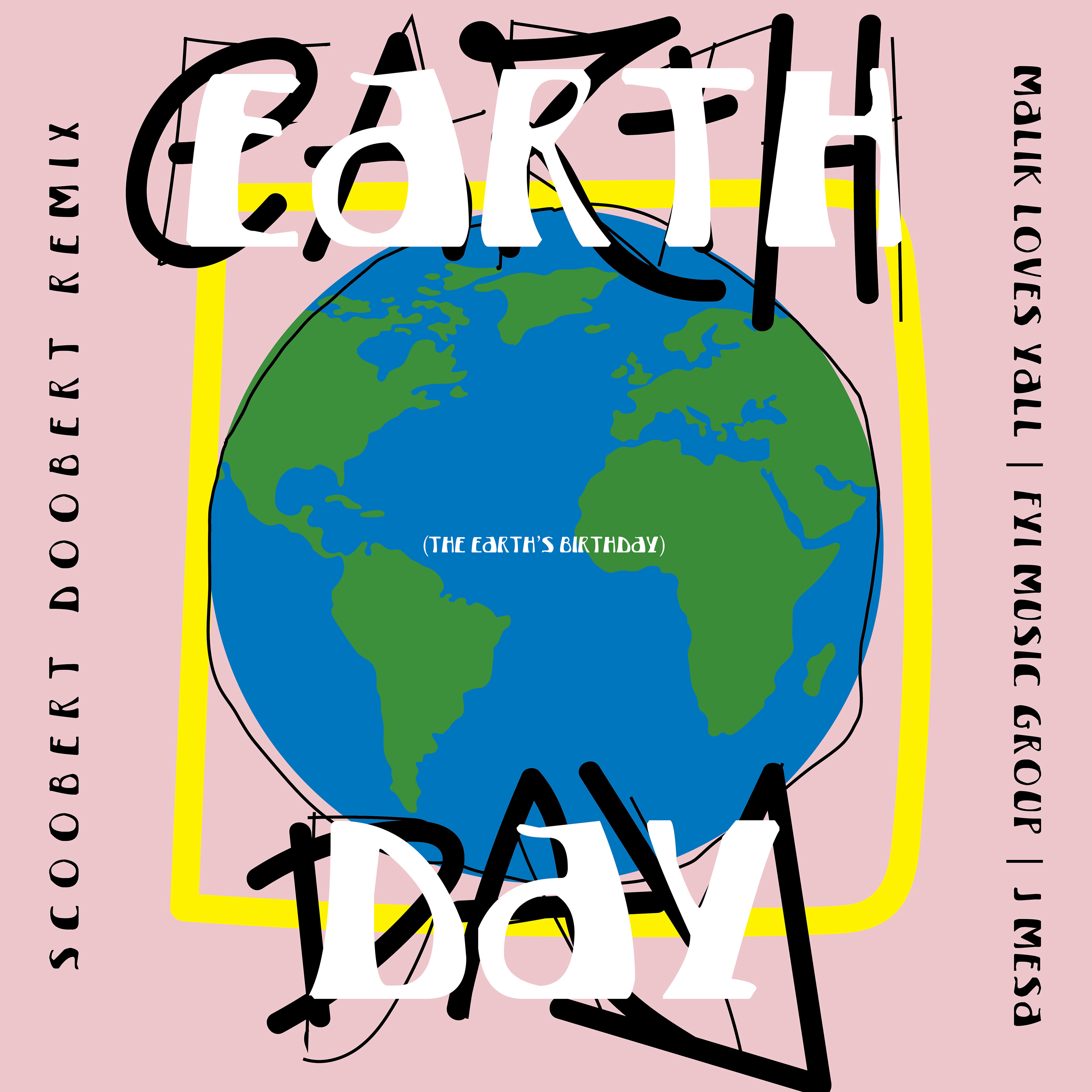
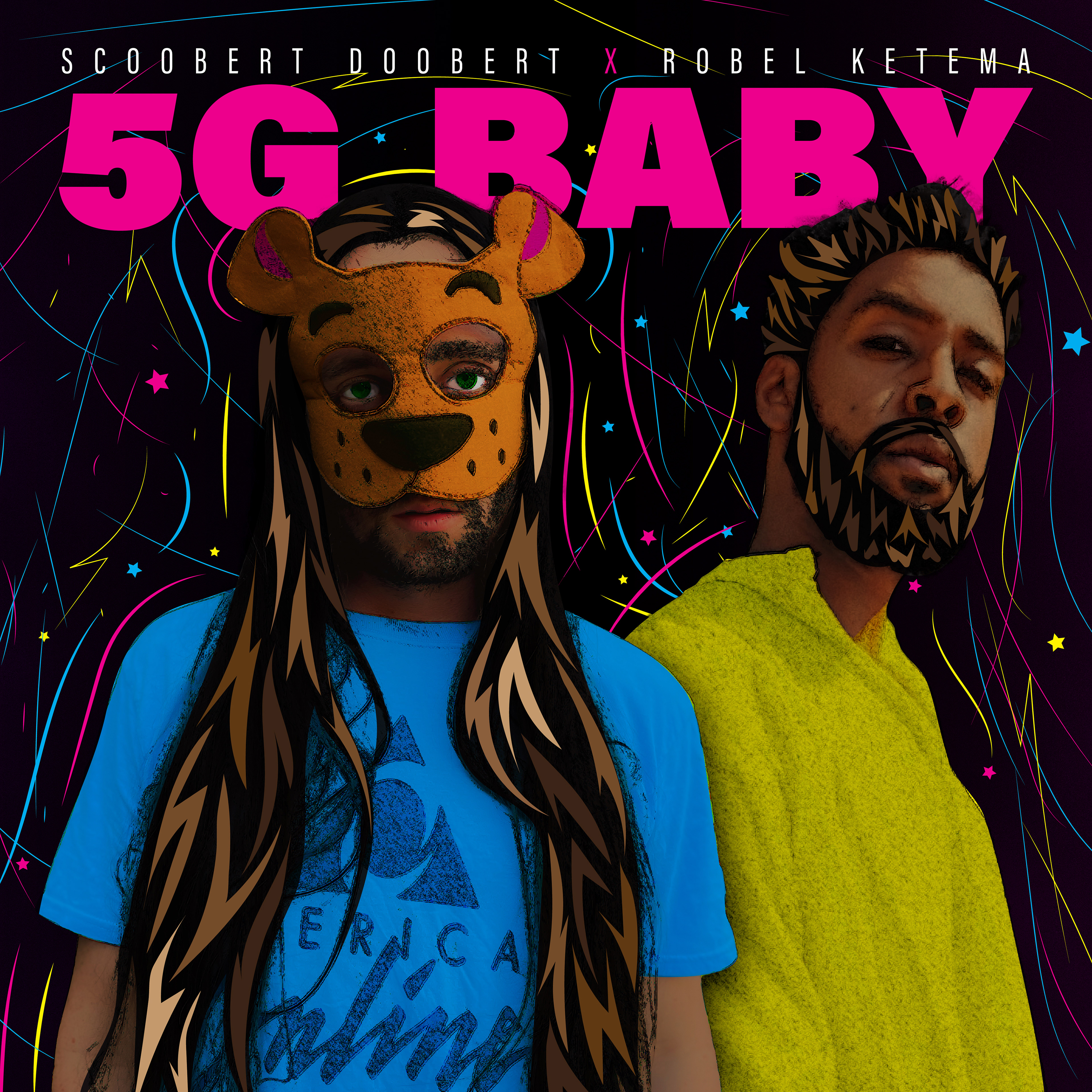
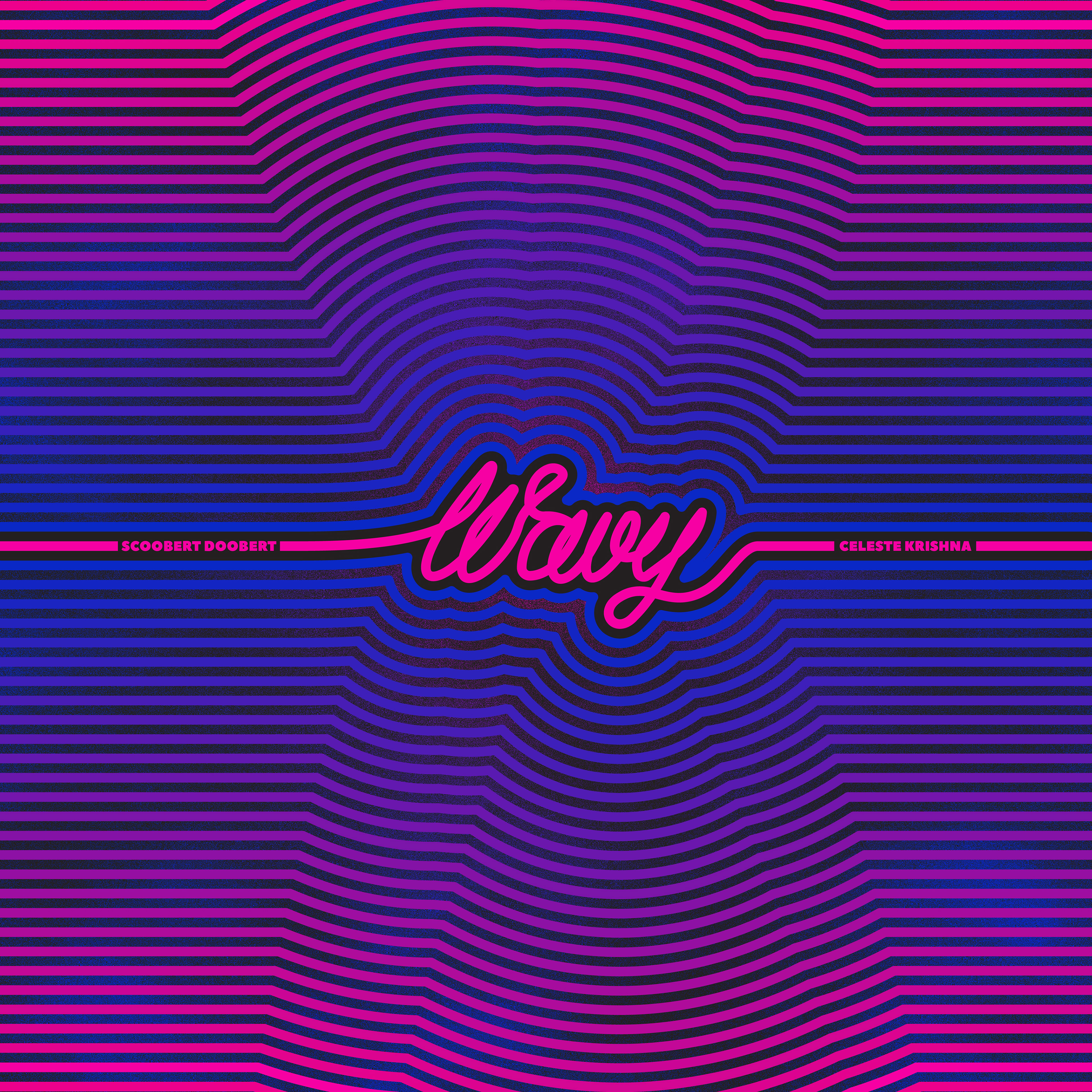
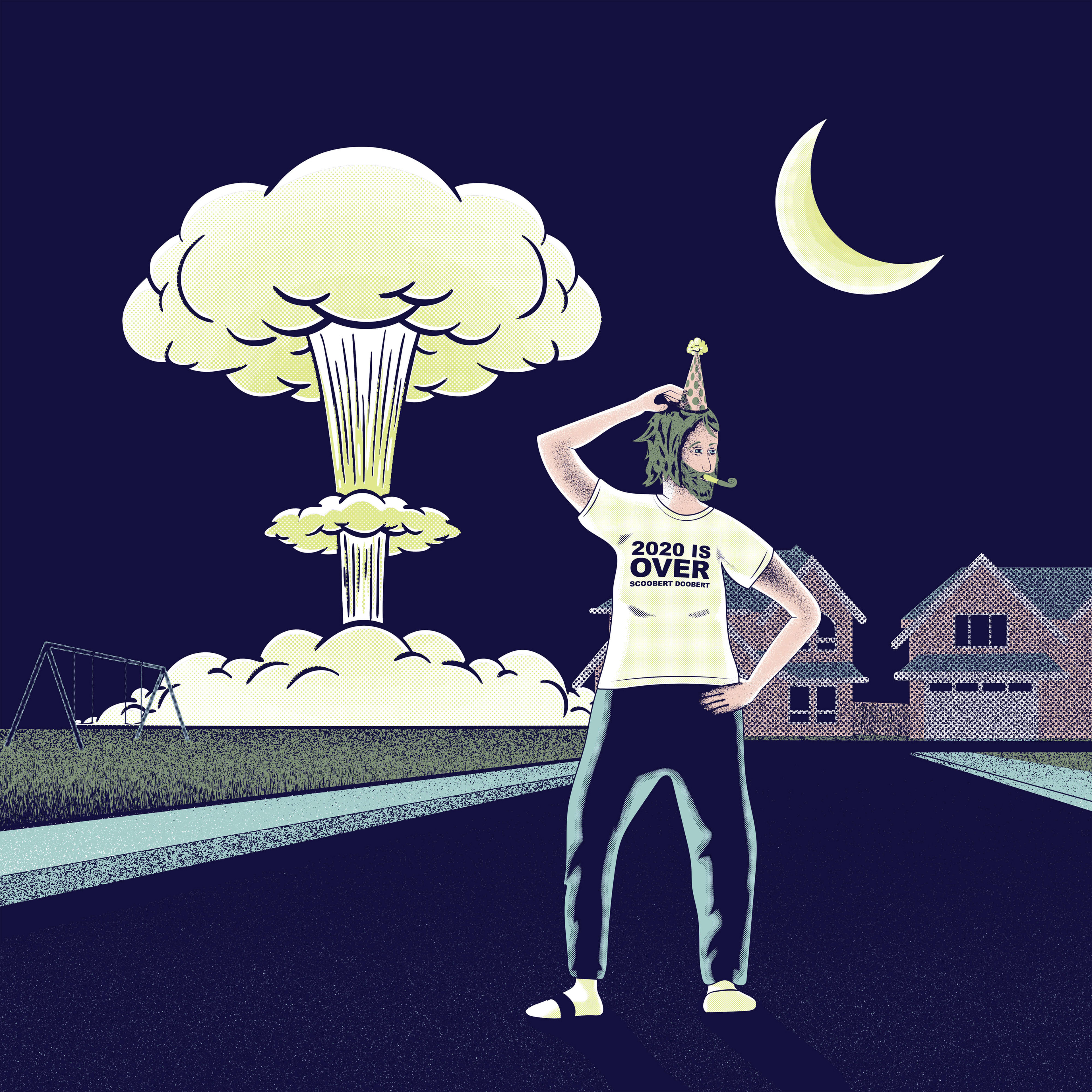
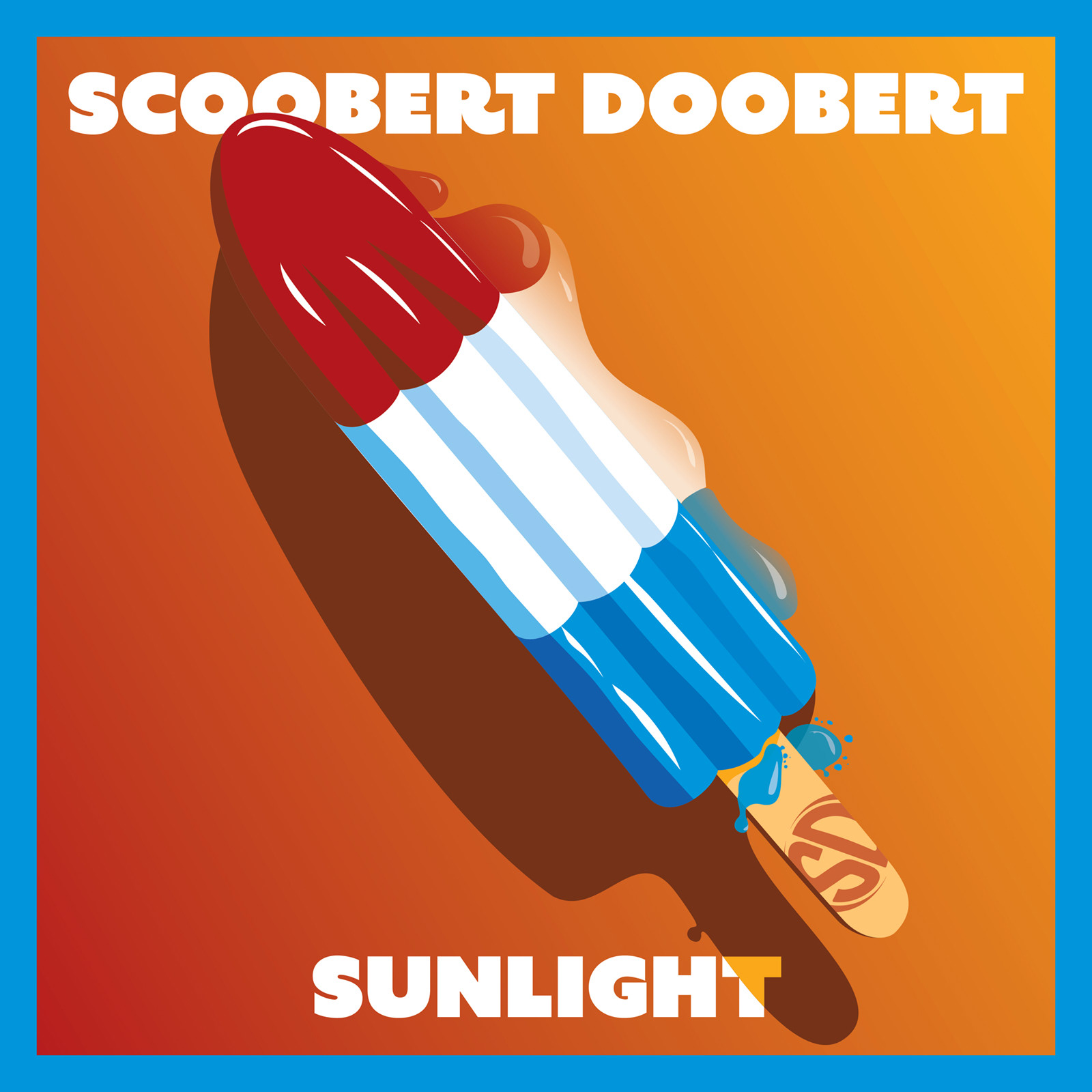
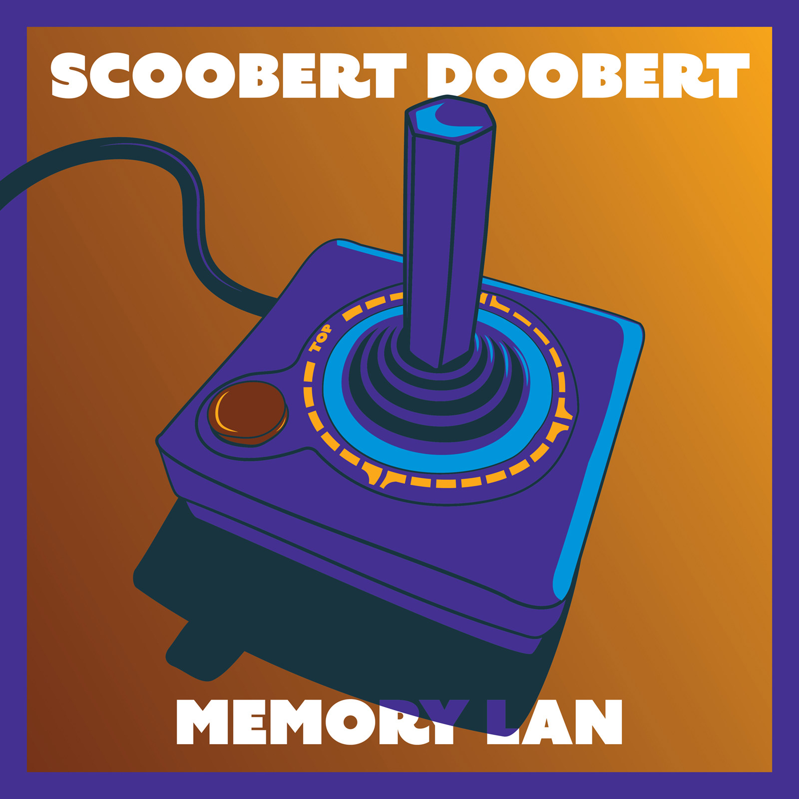
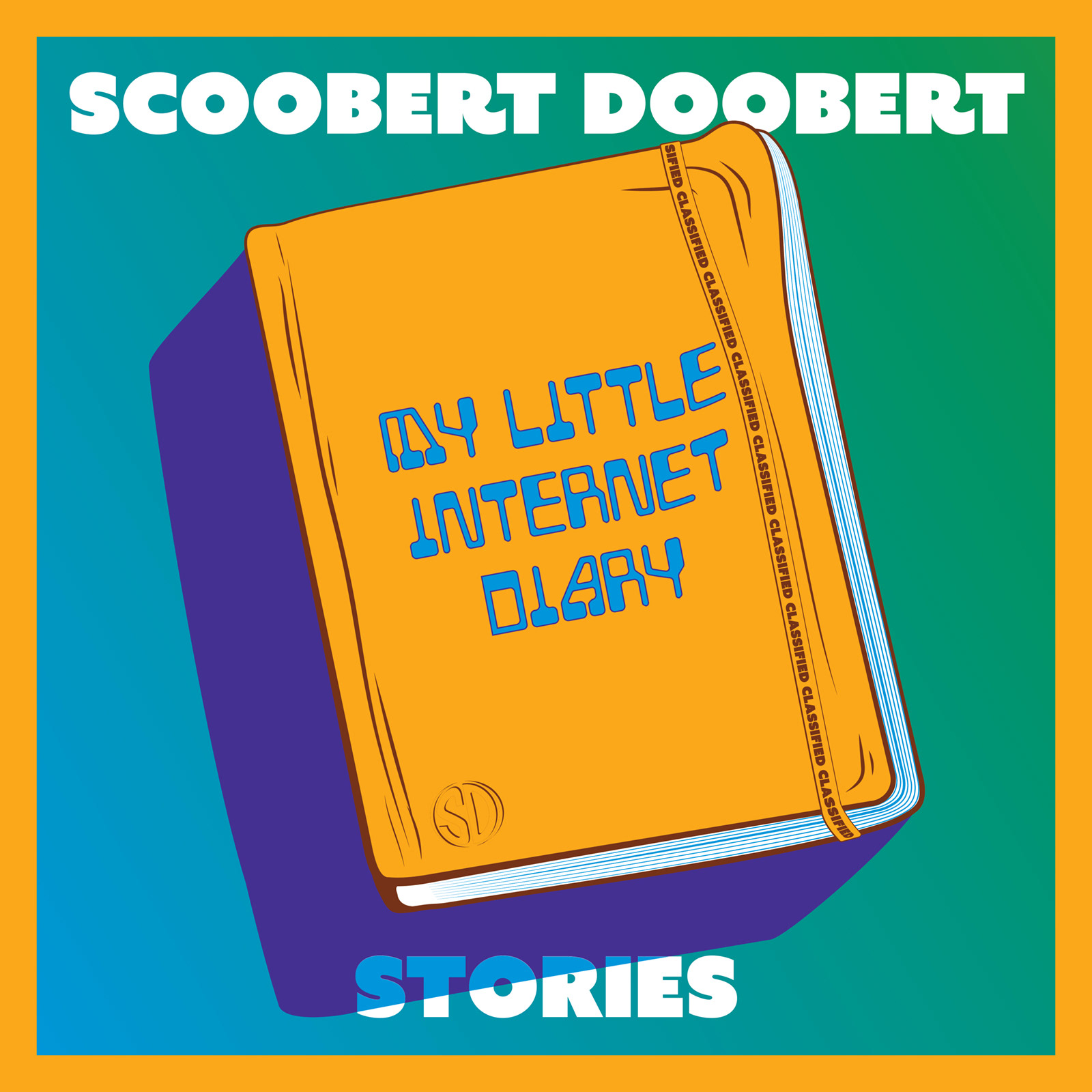
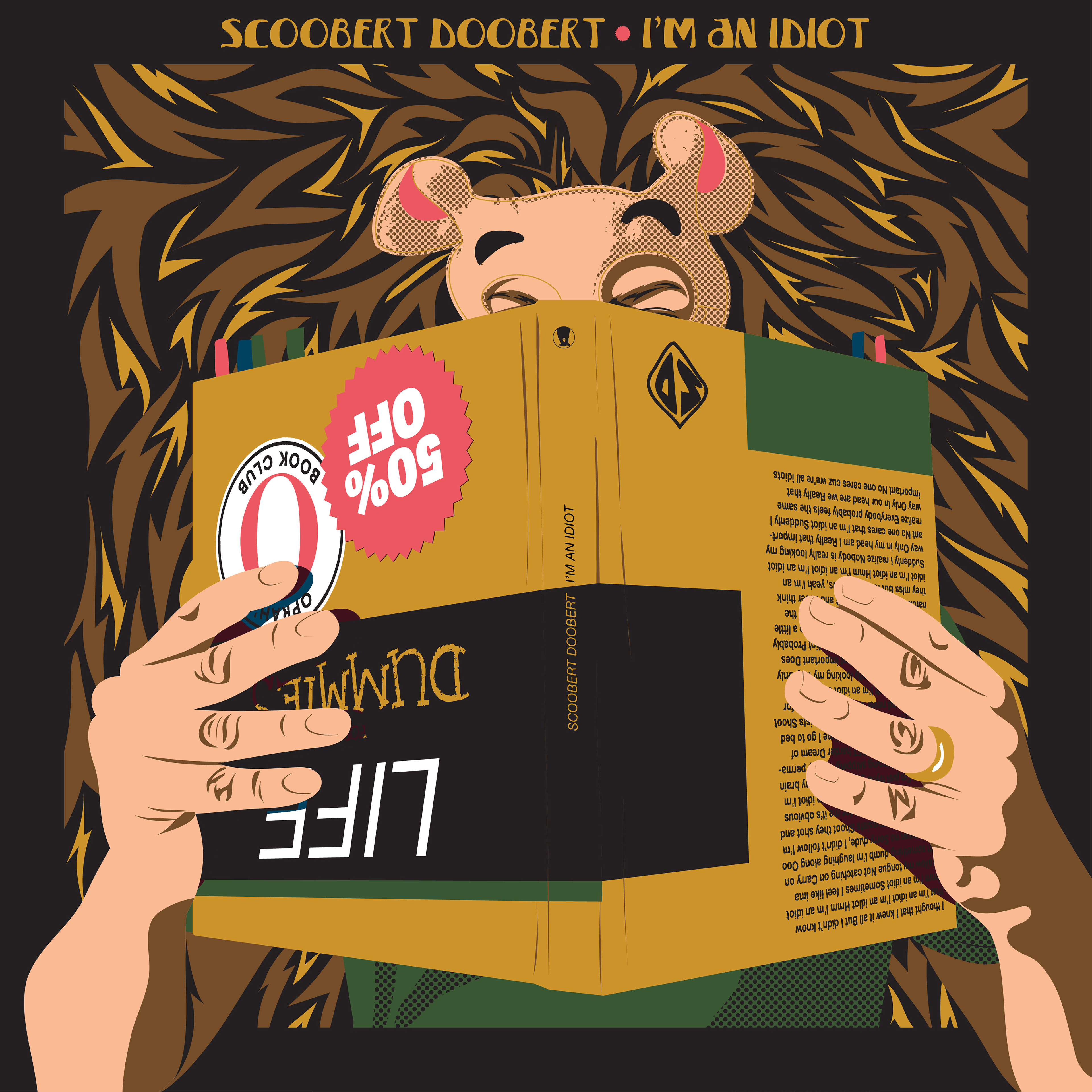
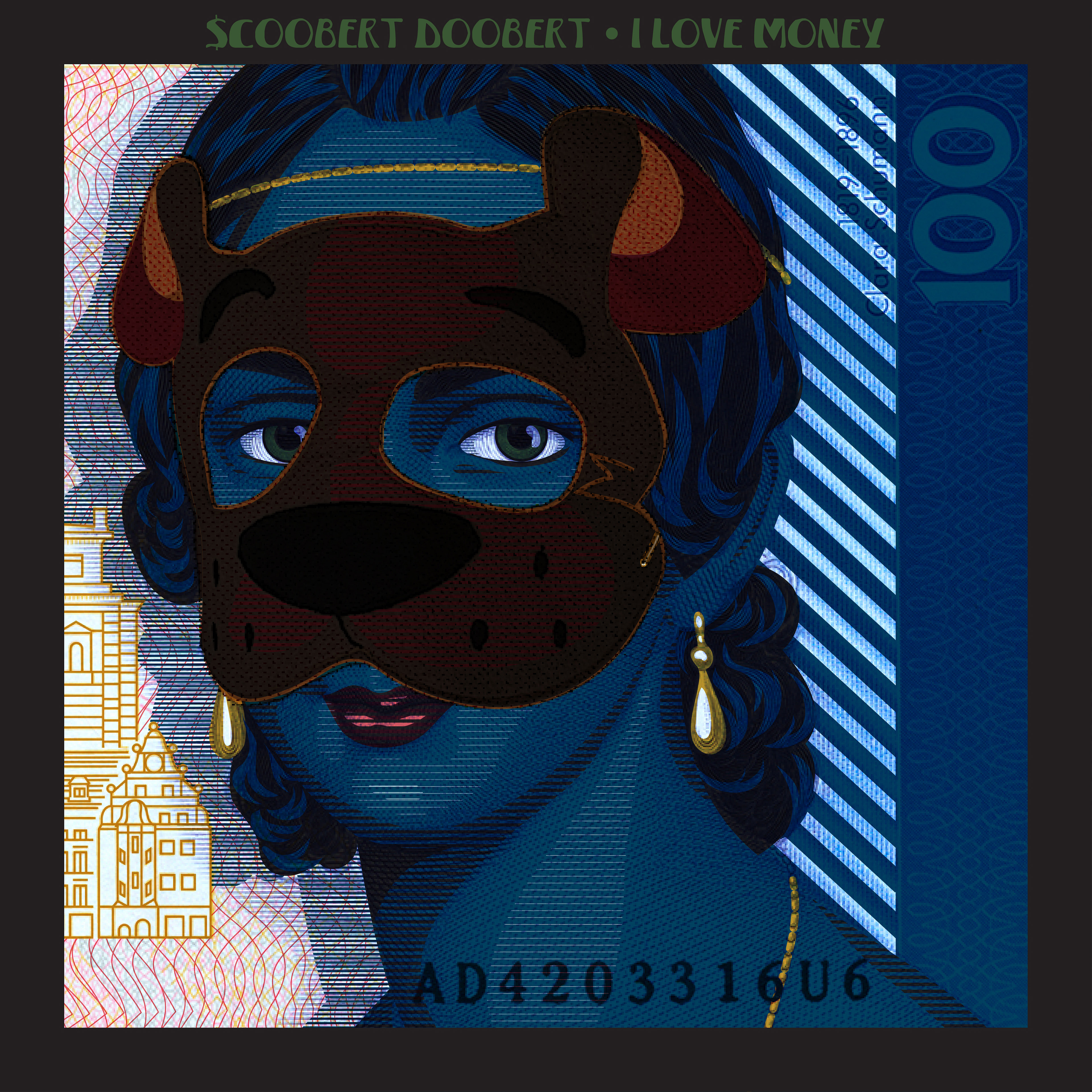
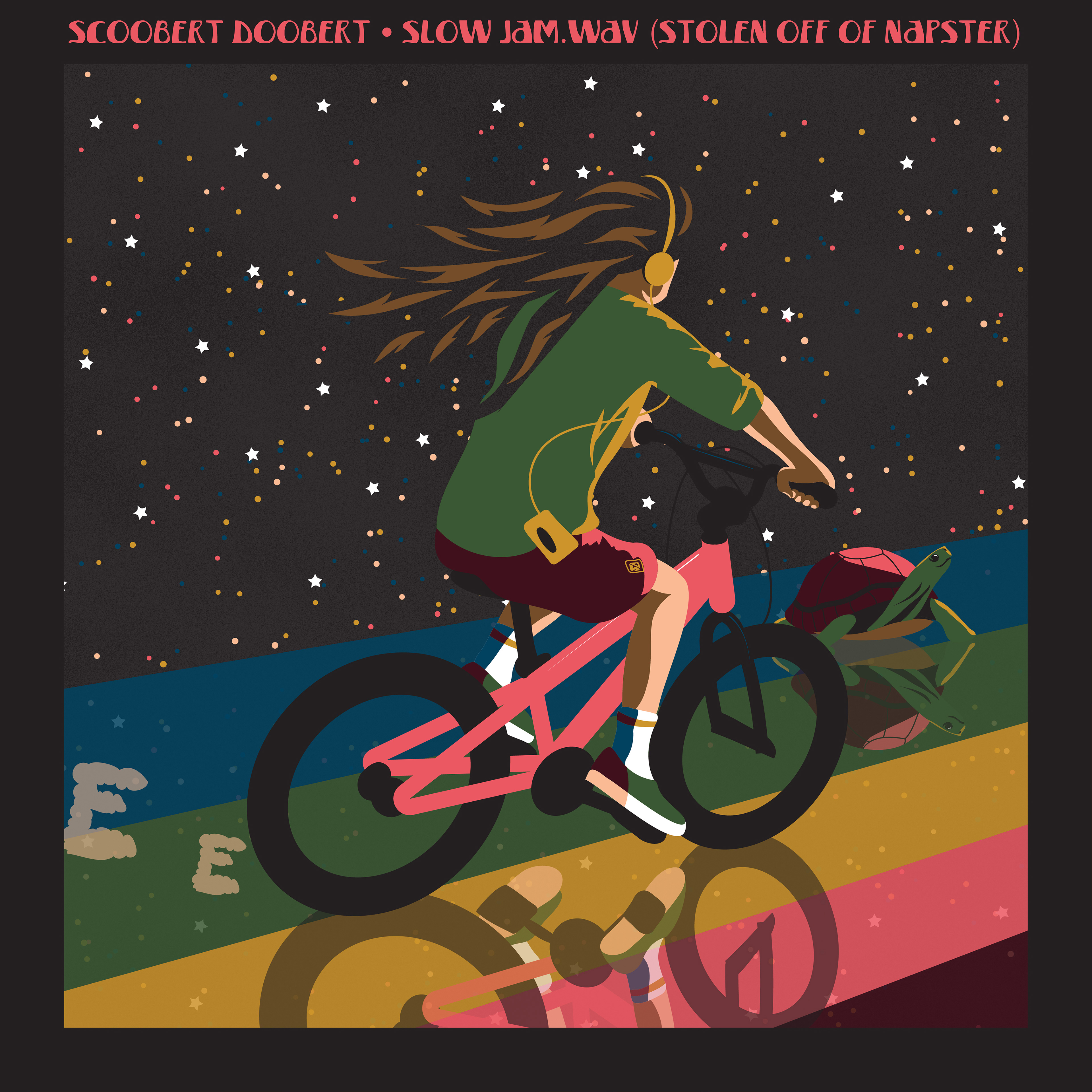
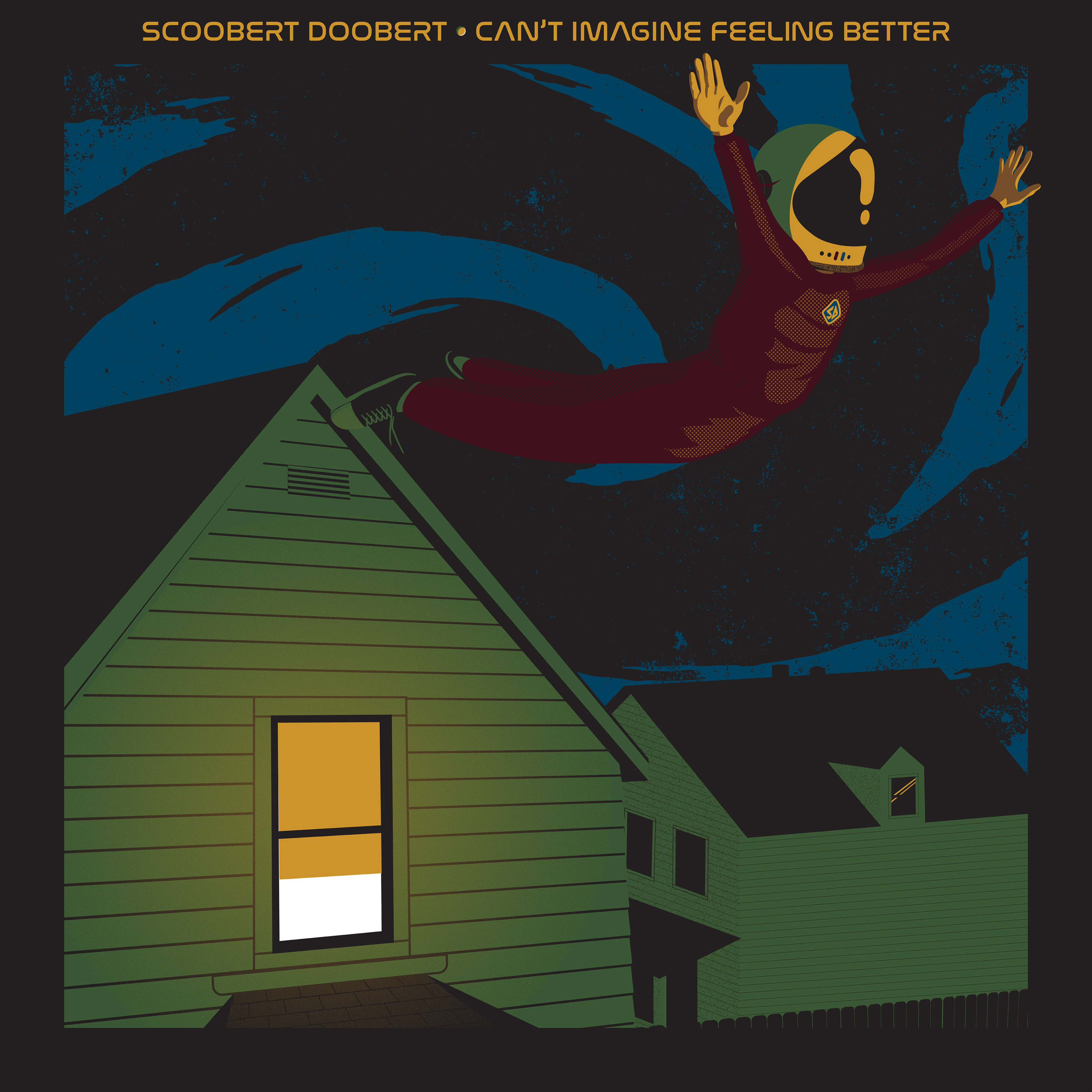
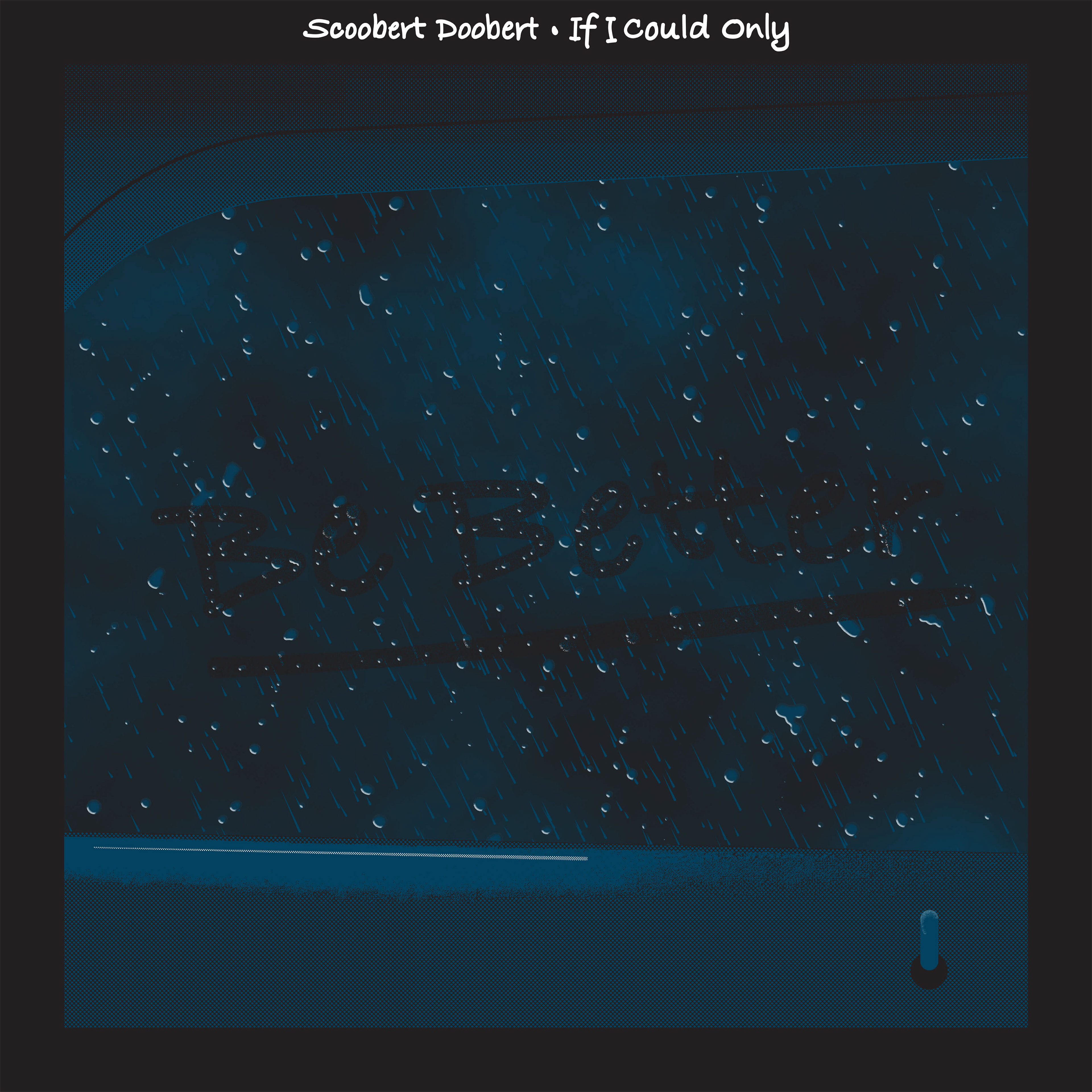
Outside of the album cycles, each standalone single became an opportunity to explore a new visual direction. Rather than following an established system, every cover was developed to reflect the personality of its individual song while maintaining the recognizable Scoobert Doobert identity through bold illustration, limited color palettes, and expressive typography. The result is a collection of independent pieces that are visually unique while still feeling connected to the larger body of work.