Beformer
Brand Merchandise
Brand Merchandise
Each illustration was designed to function as both merchandise and a recognizable social media profile image for the record company, giving every release its own distinct identity. While each graphic stands on its own, they were intentionally created as a cohesive collection, encouraging the audience to connect the artwork and interpret the larger narrative through their own imagination.


Stellar Vision (2021)
Using my own face as the reference, I illustrated a surreal portrait inspired by the feeling of getting lost in great music. As the music takes over, the headphones bloom with plants, flowers, and mushrooms, while mushrooms continue growing through the beard. The reflection in the glasses transforms into outer space, representing music's ability to transport the listener beyond their surroundings. To complete the illustration, the Beformer logo is seamlessly integrated into the headphone cord, becoming part of the natural curl of the cable.

I Scream (2021)
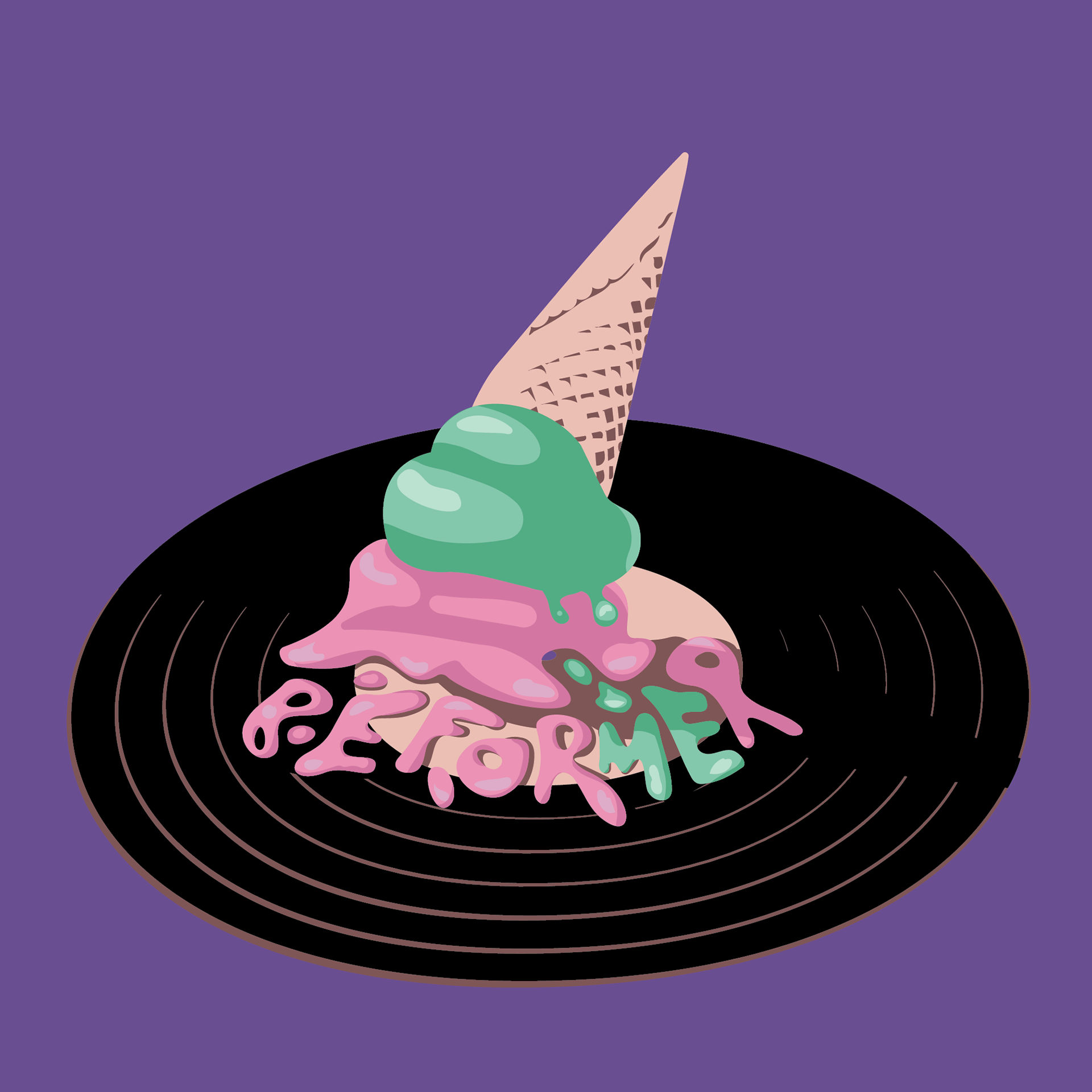
Inspired by the color palette of Stellar Vision, this illustration expands on the story established in the previous piece. The concept imagines the character becoming so immersed in the music that he drops his ice cream onto a vinyl record. As it melts, the spill forms the word "Beformer," creating a new kind of groove that visually connects music, movement, and the band's identity. The piece continues the playful, surreal narrative while reinforcing the idea that great music can transform the ordinary into something unexpected.

Moving in Stereo (2022)
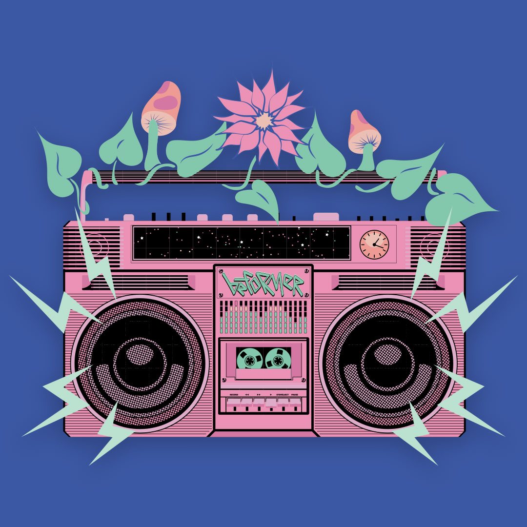
Continuing the surreal story established in the previous illustrations, the music now plays through a retro ghetto blaster, suggesting the groove has taken on a life of its own. Plants and mushrooms continue to flourish from the handle, while the radio display reveals the same deep-space scene seen in Stellar Vision, visually linking the two pieces. As a final personal detail, the clock is set to 2:19, a time that held special significance for the client, adding a subtle hidden element to the illustration.

Tape Drip (2023)
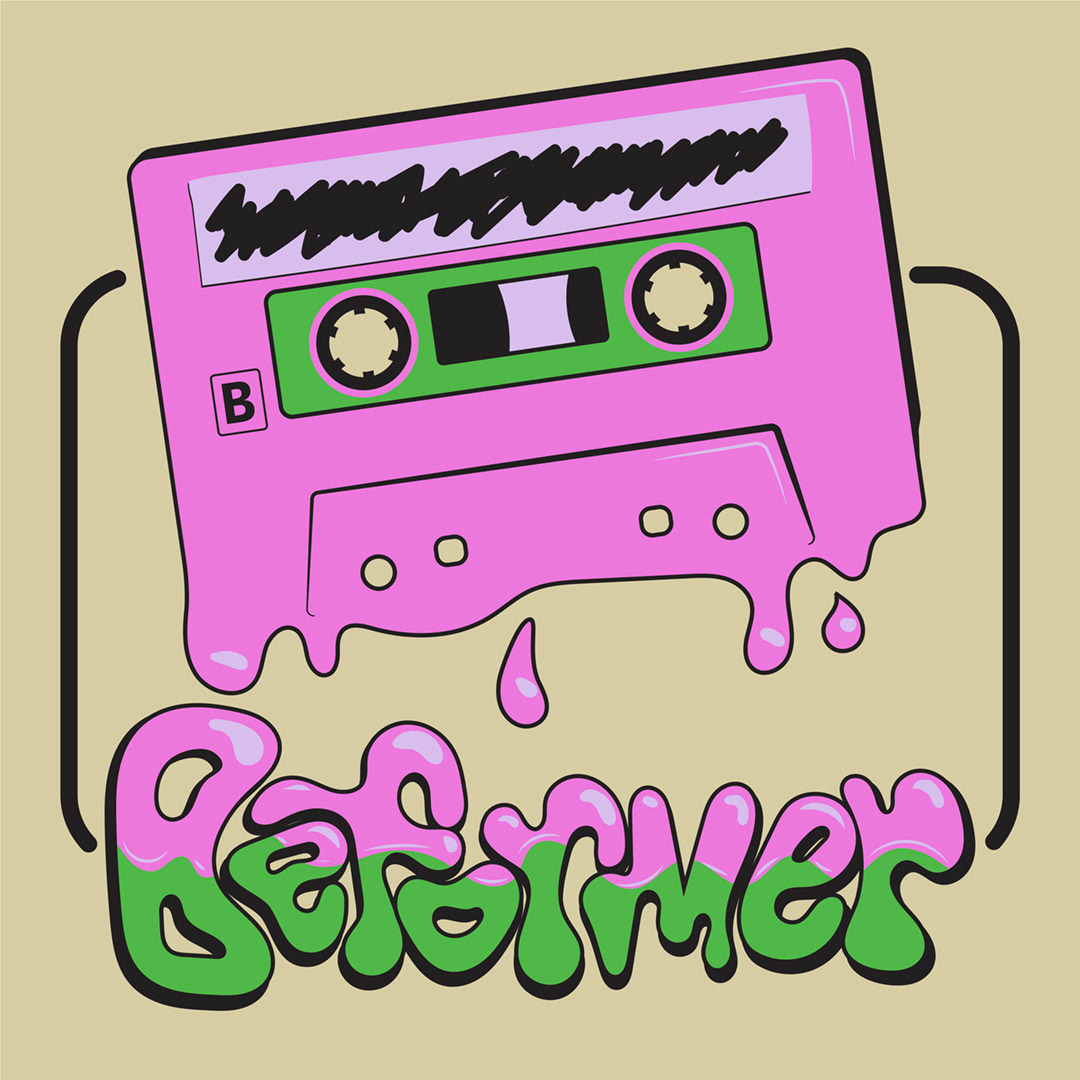
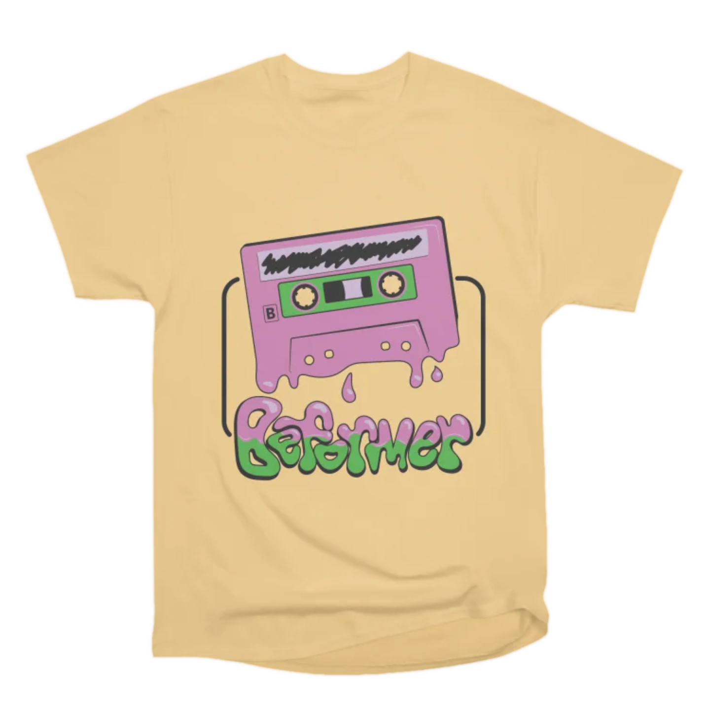
Building on the previous illustrations, the color palette shifts to brighter, more energetic hues, reflecting the evolution of the visual series. The concept imagines the music being so hot that the cassette itself begins to melt, dripping into the word "Beformer" below. By transforming the record label's name into the melting tape, the illustration reinforces the playful, surreal narrative while celebrating music's ability to leave a lasting impression.